Sunday, June 23 2013
Is the Bull Dead and the "3rd Leg Down" Starting ???
- we don't think so, but what if it is?
Read on...
Everyone, and I mean everyone, with money in the stock market knows that the bull market is the result of the Fed's stimulus, the so-called Quantitative Easing (QE3). QE3 is basically the Fed printing money at an alarming rate ($85 billion per month) and buying bonds to keep interest rates artificially low to facilitate borrowing and hence to stimulate the economy. But, it is not working (see our previous email below). Of course, the stock market likes any inflow of new capital that goes into equities, even if it is not creating new jobs, etc., and the fat cats do not want it to stop (yet).
Our Beloved Ben Bernanke (BBB) put the brakes on the bull market last week. He drastically reduced the criteria under which the Fed would start throttling back on the money printing (referred to as "tapering"). BBB raised the unemployment rate criteria for the Fed to start "tapering" from 6.5% to 7.0%. Since the unemployment rate is now 7.4%, his change brought the target much closer to today's unemployment rate. Hence, it did not take long for big investors to realize that they could not count on QE3 well into 2014, but much closer to the beginning of 2014 (or even the end of 2013). So, of course, many large investors ran for the hills.
We believe that it is possible that most of the selling last week came from big, professional "traders" who see the market horizon from a few days to a few weeks, and not from the large institutional investors who have a longer-term view of the market.
The good news is that, with MIPS, we will do well either way (see below).
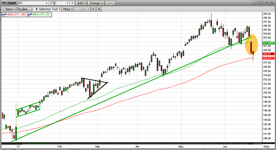
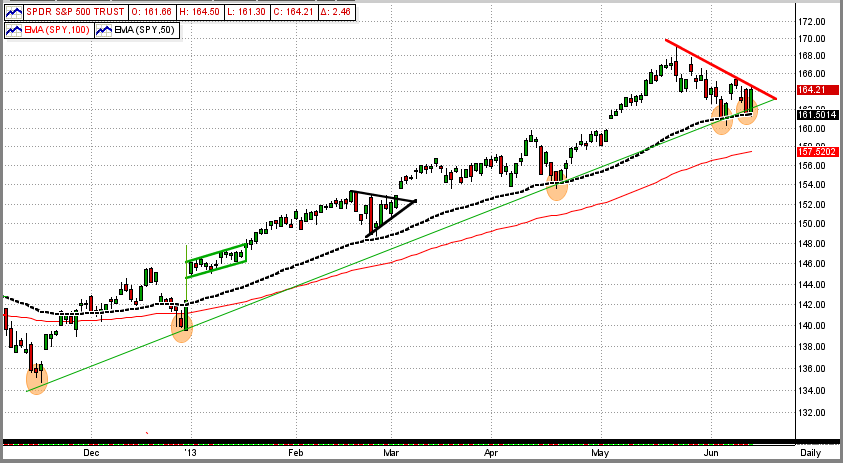
The short-term view of the market looks terrible - big sell-off last week, with a down gap on Thursday. The SPY broke its 50-day EMA, but bounced off its 100-day EMA to the upside.
So, why aren't we worried (yet)?
Mainly because we are intermediate-term investors and not day traders. And, a short-term drop of 3-4% does not usually signal a directional change in the stock market. Take a look at the monthly chart below. In this long-term view, the disaster on the daily chart is hardly noticeable on a monthly chart. This means that we need to wait and see.
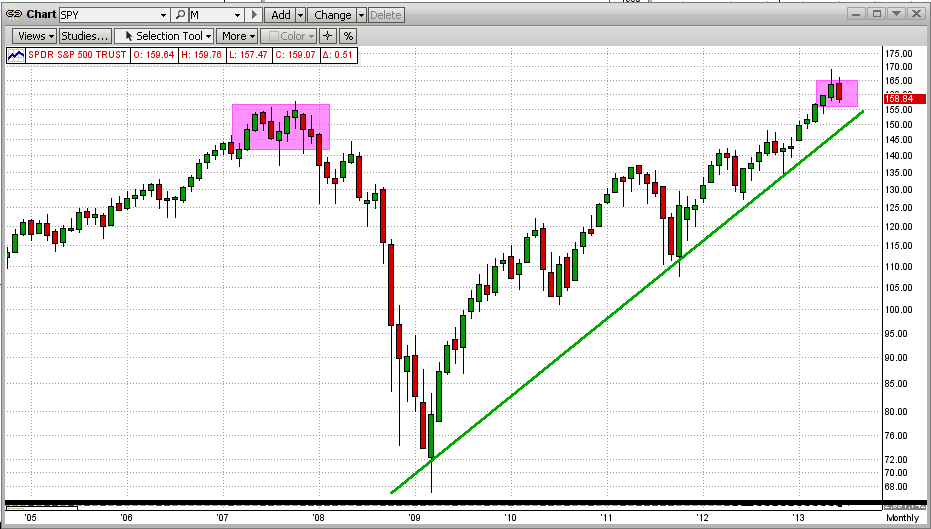
The other good news is that strong bull markets (4-5 years up) do not turn around easily or quickly. For this, let's look at the two most recent market "crashes", one in 2000 and the other in 2008. From the graph below, we can see that it took 8-10 Months for these bull markets to give up and collapse. At this time, we are only one week into a downtrend, so we have plenty time if this is the "Big One".
OK, got it. But what if is the the "Big One" ?
For that, we have to rely on MIPS. The MIPS models have been around since 2004, and the MIPS3/MF signals have been tracked by TimerTrac.com since 11/04/2005. During that time, we have had several intermediate-term downtrends and MIPS has profited from most of them (of course, MIPS beats the SPY in up markets by detecting and shorting these downtrends).
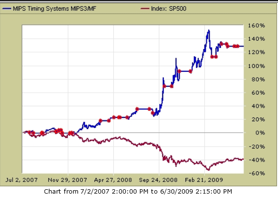
But, we have had only one really big stock market "crash" in this timeframe and that was from 4Q'07-1Q'09, when the S&P 500 dropped by over 50%. How did MIPS do in that market? For that, see the TimerTrac.com performance graph below
- see the graph below for the period of the last big market crash (mid-2007 to mid-2009)
- this graph is from TimerTrac.com using verified MIPS3/MF signals
- the "red dots" in the graph are the dates of the MIPS3/MF verified trades.
MIPS3/MF +130% SPY -40%
So, let's sleep well and wait for MIPS to tell us what to do.
Friday, June 14 2013
All MIPS models have been "riding the wave" since the end of Nov'12; and they have not been sucked into the "wiggles" along the way. In the graph below, see how the SPY has hit and bounced above its 50-day EMA along the way (including those in the last 7 days).
- Trendline is green; 50-EMA is dotted black; 100-EMA is red.
This stock market has been highly volatile lately, mainly out of fear that the bull run is almost over. Of course, everyone believes that they have the answer as to why the bull market is dead or why it still has legs. To answer that, however, it seems that we should first try to identify why the market has been so strong over the last 4 four years (i.e., since the the crash of 2008).
Usually, stocks increase in value from rising profits, which in turn, result from a strong economy, strong consumer spending, and good fiscal policy. And, of course, strong economies result from productivity increases, steady commodity prices, good jobs, reasonable consumer consumption, low interest rates, people living within their means, low consumer debt, etc.
Everyone has hashed and rehashed their reasons for (a) the ups in the markets (liquidity from the Fed, job creation, improving economy, the salvation of the Euro, etc.) and (b) the downs in the market (rising interest rates, not enough new jobs, slow growth, the PIIGS still weak and getting weaker, irresponsible fiscal policies in Japan, rising interest rates at home etc.).
All of this is important and variations in the above cause daily, rather minor up/down cycles in the market (mainly from big traders with a one-week horizon). But the big, long-term trend is ALL about the flow (or velocity) of money and where the money actually comes from. Remember, M1 is the "money supply" and M2 is the velocity of said money. There are good and bad MIs and M2s. A good M1 is when the money comes from companies buying raw materials and making products that are sold throughout the world to people working to produce those raw materials and to buy the finished goods. A bad M1 is when the money is coming from the Federal Government simply printing more-and-more money, like over $80 billion monthly now (which I call "Fake Money").
In my 25+ years of reading about stocks and stock markets, the most solid reason that I know of for stock market movements up and down is the accessibility and cost of money.
In poor economies and/or recoveries, governments print Fake Money to make more money available to consumers and corporations through low interest rates, entitlements, giveways, etc. Over time, of course, the more money that has been printed the less said money will be worth (declining value of the dollar) and hence the less it will buy, aka inflation.
This policy has always failed and it always will fail. It is not working here now. Japan has tried it for the last 20 years with very negative results and they are still doing it. Albert Einstein once said, "The definition of insanity is doing the same thing over and over again and expecting different results."
Here are a few examples of how the money (our money) that Ben and Japan are printing is "helping" the economy AND your stocks.
1) Individuals - Ben's buying of Treasury bonds is keeping interest rates extraordinarily low (to a fault). Individuals are buying houses now en masse with 15-year mortgages at 3%. In the next few years, home mortgages will most likely be back up to a more reasonable 6% and our government (you and I, that is) will own the debt at 3%. Thanks, Ben !!!
2) Corporations - Big companies (like IBM, GE, Exxon, etc.) are borrowing money at rates as low as 1.5% and are using said money to buy back their own stock (a lot of good that does for us). This buying pressure is pushing their stock values higher and it is lowering the number of their shares on the market. From this activity, of course, their earnings per share goes up, even if their total earnings are flat !!!
3) Big Investors - Hedge funds and ultra-wealthy billionaires are borrowing money in Japan at near zero interest rates and buying assets throughout the world. And, they "know" that they can get a better return on the borrowed money than the interest rate at which they borrowed. Hence, they are making their money using the government's money. The big guy's success depends upon the assets that they buy and the currency relationship between Japan and the other counties. In trying to navigate through all of this, they are causing tremendous volatility in all markets, including ours. Believe me, our stock market is interrelated with all major stock markets throughout the world.
The moral of this is that our markets most likely will not suffer a large drop as long as the Fed is printing and giving away your money, but it will not be a pretty outcome if they do stop in the near term. You better make money in this market because the money you will have 5-10 years from now will buy much less than it does today..
Excerpt from CNBC
Thursday, 13 Jun 2013 | 10:23 PM ET
Katie Holliday
The U.S. Federal Reserve is likely to act soon to quell investor panic over the potential tapering of its bond-buying program. Speculation is over whether or not the Fed will pullback its $85 billion a month bond-buying program that has led to volatility in global markets, particularly within Asia. Japan's Nikkei, for example, has plunged near 20 percent from its five-and-a-half year high hit on May 23.
Sunday, May 19 2013
As most of you know, we recently released our newest model, MIPS4/MF+
- MIPS3/MF is still a very good model, but MIPS4/MF+ produces a "smoother ride" along the way.
Therefore, for individual investors, MIPS4/MF+ is the model you should use if you are going to
trade with "leverage".
- Of course, with MIPS4/MF+ signals, you do not have to trade with leverage.
- You can trade SPY or any ETF that "correlates" well with the SPY, like IWM and QQQ.
- Many of our customers trade 1/3 each of SPY, IWM, QQQ.
More aggressive investors, however, could do even better trading SSO (the "double leverage" SPY) using MIPS4/MF+ signals with some portion of their MIPS money.
Since I am "in-the-middle" of the risk tolerance crowd, I trade double leverage SSO on long signals and single leverage SH on short signals
- but, if you trade with leverage, you can choose whichever of the trading strategies below that
fits your own risk tolerance.
The following are three MIPS "Performance Reports" using MIPS4/MF+ signals in the period 2007-3/31/13:
ETFs Traded_________ ........Comp Gwth............Max DD
1) SPY long / SH short.............33.0%................. -10.63%
2) SSO long / SH short............54.1%................. -16.13%
3) SSO long / SSO short..........72.0%................. -18.14%
Hope this helps.
Thursday, May 16 2013
For the MIPS Members that do not remember, we do have an indicator on our website that shows roughly how MIPS sees the strength in a current market.
Market Strength Indicator
Even though it does not represent signal changes per se, we do have a graph on our homepage (1/3 down in the middle) for what we call the MIPS "Market Strength Indicator" (MSI). The MSI is a "mix" of some of our most reliable indicators. We believe that MSI does represent the "direction" of market strength (up or down), BUT IS NOT INTENDED TO BE A SIGNAL CHANGE INDICATOR. That said, the MIPS models usually do not issue a trade signal change when the MSI is really strong or really weak (but it can, with a true out-of-the-blue key reversal pattern).
We usually recommend that new MIPS users NOT join in on an existing signal if the slope of the MSI is trending against the signal (like don't go long when the MSI is trending down). Once in, however, simply follow the MIPS signals AND please DO NOT try to use the MSI as a signal change indicator.
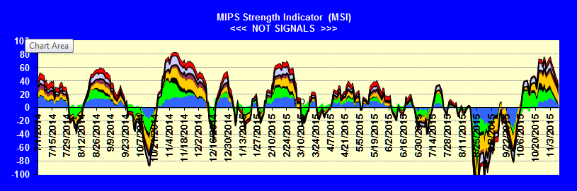
This graph is usually updated about twice a week
Saturday, May 11 2013
As with almost everything in this world, the behavior of the stock market is made up of actions from millions of people. And, as with almost everything in this world, the stock market does kind of repeat itself. The $64,000 question is what is repeating and when?
This week I saw a talking head on CNBC discussing what was going on in the market and why, and if the current 5-year bull market would continue. Like most others, he gave a very nondescript answer. His short answer (and my interpretation of his answer) was that the action of the stock market would follow one of the options below:
1) Rational Exuberance - 60% (that is, keep going up as it should)
2) Irrational Exuberance - 30% (that is, going up faster, even though it should not)
3) Market Crash - 10% (that is, a complete reversal from today's bull market action).
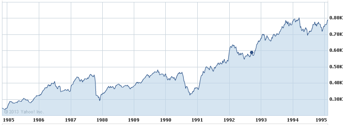
This reminds me of three market behaviors of the Nasdaq in the 1990's (when Alan Greenspan coined the term "Irrational Exuberance").
Graph 1 - Rational Exuberance
This graph shows the Nasdaq from 1985-1995, when the index TRIPLED, but did so because technology was booming. This fits "Rational Exuberance" because everyone was happily making money on the high growth of companies like Microsoft, Oracle, Cisco, etc. In this 10-year period, the Nasdaq rose in value from about 250 to 775, ending with "overbought" conditions, nose-bleed P/E ratios (Cisco had a P/E ratio of over 100), etc. Then, the pundits were were crying, GET OUT!!!
Were they right?
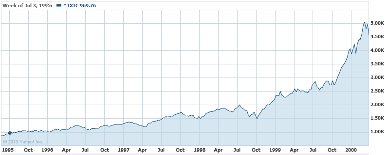
Graph 2 - Irrational Exuberance
Of course, the pundits were right about the fundamentals, but DEAD WRONG about the Nasdaq market performance
- the proof lies in the following 5 years' performance [that is, in the time period of 1995-2999 (Graph 2)]
- this is when everyone (especially the little guys) went into panic buying ("Irrational Exuberance")
- the net result over this 5-year period was that the Nasdaq WENT UP OVER SIX-FOLD, from 775 to 5000, with
crazy things like Cisco's P/E ratio growing to over 400, Yahoo's market cap being more than the GDP of Iceland, etc
Graph 3 - Market Crash
We all know that US stock market indices went up in smoke after the year 2000, but getting out in 1995 was way too early.
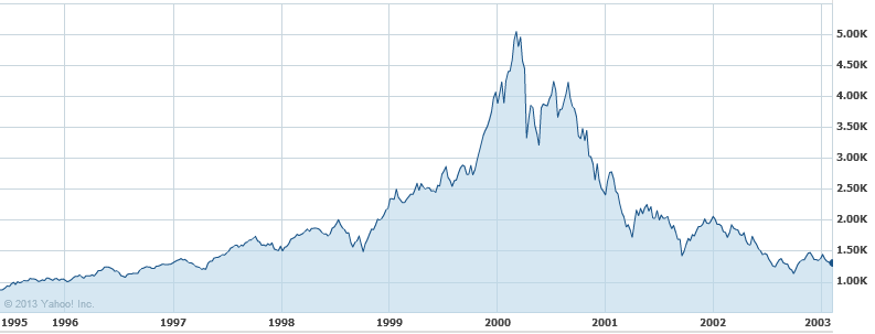
OUR POINT IS THAT SINCE THE MARKET DID RECENTLY BREAK TO THE UPSIDE AND SET NEW ALL-TIME HIGHS, AND IF THE BIG GUYS GET THEIR WAY, THE LITTLE GUYS CAN PUSH THIS MARKET WAY HIGHER THAN IT SHOULD GO (like 1995-2000), AND THEN THE BIG GUYS WILL DUMP BIG-TIME (like 2000).
BUT, IF THE LITTLE GUYS ARE NOT ABLE TO KEEP THE SPY ABOVE ITS CURRENT RESISTANCE LEVELS, THE BIG GUYS WILL MOST LIKELY SELL DOWN. OF COURSE, THIS CAN RESULT IN (1) A RELATIVELY SMALL DIP WITH A CONTINUED UPTREND OR (2) A BIG MARKET CRASH (like 2000).
We certainly can't predict what will happen from here, and that is why we developed and follow the MIPS models. If and when this market makes a major change, MIPS will most likely miss a minor part of the change, but will find and follow the resulting trend. And, MIPS should ignore minor changes to prevent getting whipsawed.
Wednesday, May 01 2013
Are we tied to a market that will continue a smooth ride up for some time to come? Sure feels that way. Ole Ben keeps printing money, the little guys (retail investors) keep buying the market back up after every dip that results from the big guys' selling, the economy is holding its own, the market is moving in a near-perfect immediate-term trend and MIPS is following it to perfection, etc. See Graph #1 immediately below.
Graph #1
So, what could go wrong? There are many fundamental values that could could derail the market, but that is outside of the scope of this blog (and you can read about that all over the Internet).
From a purely technical standpoint, two things are very dangerous.
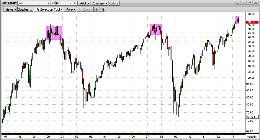
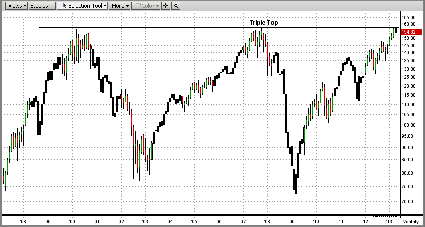
1) The first is the 13-year Triple Top that we discussed in the previous email below (see the very last graph).
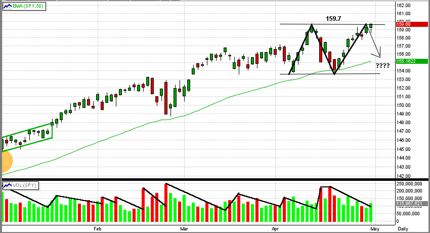
2) The second is closer to home. In Graph #2 below, you can see the potential formation of a near-term perfect
double top. If the SPY fails at breaking 159.7 to the upside and heads down, this could represent (a) a dreaded
sideways pattern at best, and (b) a double top worst case.
Graph #2
As always, let's wait for MIPS to tell us what do do.
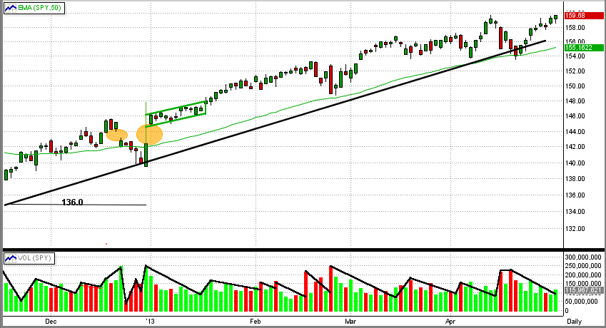
Friday, April 19 2013
Sometimes things just ain't what they seem. You can look at one single thing from two different viewpoints, and it can look like two very different things.
For example, take the recent stock market behavior (Graph #1). When we look at it from a short-term perspective (days/weeks), the recent market looks somewhat violent and erratic. Previously, the market was following a fairly smooth trendline, and recently it seems to be diving. The SPY broke this trendline to the downside today, but bounced back a little and settled right on top of its 50-day EMA. Everyone is jittery about which way the market will go from here. The answer, of course, is not in these numbers. All we are seeing is what engineers call "noise" and not yet a new trend. Trends take longer to develop, and that is what MIPS is all about.
Graph #1
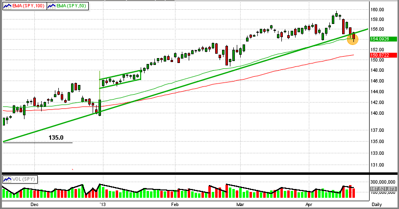
Graph #2
Now, if we look at the very same time frame (last few weeks) on a longer-term scale, it looks like almost nothing is happening recently (last little "bar" on the top right is the entire month of April 2013). But from here we can see that we are "sitting on the fence" of what will most likely be a new, dramatic move. We happen to be sitting on a time-bomb of a 13-year Triple-Top. The SPY hit and stopped going up at almost exactly $157.5/share for the third time in 13 years (2000, 2007, 2013). You can see from Graph #2 that the market does not dilly-dally for long periods at these "tops", mainly because everyone has their finger on the trigger. We all want to move very fast when a new trend (up or down) becomes apparent. So, let's be very attentive and watch for signals from MIPS.
Sunday, April 14 2013
By now, most of you know that we have been working on a new, slightly faster trading model for over six months
- we are most pleased to officially introduce our new "MIPS4/MF+" model
- the name comes from: (a) MIPS4 to identify a new model, and (b) MF+ meaning medium-frequency "plus"
- MIPS4 is an offshoot of MIPS3, but uses algorithms from all MIPS models.
As with all of the MIPS models, with MIPS4 you can trade any ETF that "correlates" well with the SPY
- and, MIPS4 is a little smoother ride than MIPS3 (i.e., with less "volatility")
- as a result, the MIPS4 model produces very "smooth" results.
For this reason, we feel comfortable approving the use of MIPS4/MF+ signals to trade leveraged ETFs.
But, of course, you do NOT have to trade with leverage...
- if you do use leverage, however, we recommend double leverage long, but single leverage short for more
conservative use of leverage.
See the table below for the performance of all of the MIPS models in the time frame of 2003-3/31/13 .
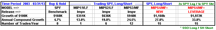
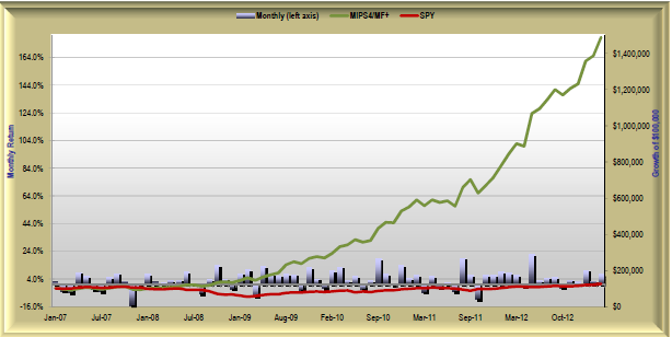
In the graph below, we show MIPS4/MF+ as compared to MIPS3/MF.Improved and MIPS3/MF.org between 2006-03/31/13. M3.org (brown line) in the graph is the performance of the original MIPS3/MF model without the improvements made in 2011-2012.

DOUBLE LEVERAGE
The graph below shows MIPS4/MF+ trading double leverage SPY (SSO) on long signals and single leverage SPY (SH) on short signals. For more performance reports, click on the "Performance" tab on the main menu on our homepage.
Monday, April 08 2013
It seems as though no one has a strong feeling for where this market will go from here. The market has hit all-time closing highs in the major indices and the retail investors (the "little guys") are rushing back into a market that they missed to the tune of over $100 billion in equities year-to-date. Other things affecting the market now are potential defaults in Greece and Cyprus, financial crises in the other PIIGS countries, interest in what the large institutional investors and retail investors will do next, interest in what the Fed will do next, etc. As always, a large number of issues/circumstances should determine the market's moves from here.
But, is this correct? One could make a strong case that the market behavior from here is not dependent upon the tens of thousands of institutional investors/traders or hundreds of millions of little guys, etc., but mainly on the actions of one man, Ben Bernanke, Chairman of the Federal Reserve.
Supposedly to stimulate the economy, Helicopter Ben has been printing tens of billions of dollars every month ($120B in 3Q'12 alone), with no end in sight. Our national debt rose by over $1 trillion last year, and we have more debt than all of the countries in the European Union combined. This will ultimately throw everything into chaos. At this time, the USA can only afford the interest payments on our national debt because Helicopter Ben is artificially keeping interest rates on mid- and long-term US Treasury bonds extremely low ("Operation Twist"). This, or course, drives bond prices up and overrides the normal reaction of bond prices to the economic outlook. Also, on the equity side, we have high quality companies borrowing money at record low interest rates to buy back their own shares, thus driving their profits in $'s/share higher due to a lower number of shares, even if their profits never changed. How long can this go on without serious consequences? By the way, what the Fed does is NOT subject to the authorization or approval of Congress or the White House (how did we let that happen?).
In his own words, Bernanke’s plan is to quit printing money only when unemployment falls to or below 6.5%. That is kind of like a family in serious debt borrowing more and more money until "things get better", even when the extra borrowing makes the “bad things" worse. How is that for "chasing your tail"? At no time in the past has any nation become more fiscally sound by taking on massive additional debt. Historically, this has only led to high inflation and/or bankruptcy.
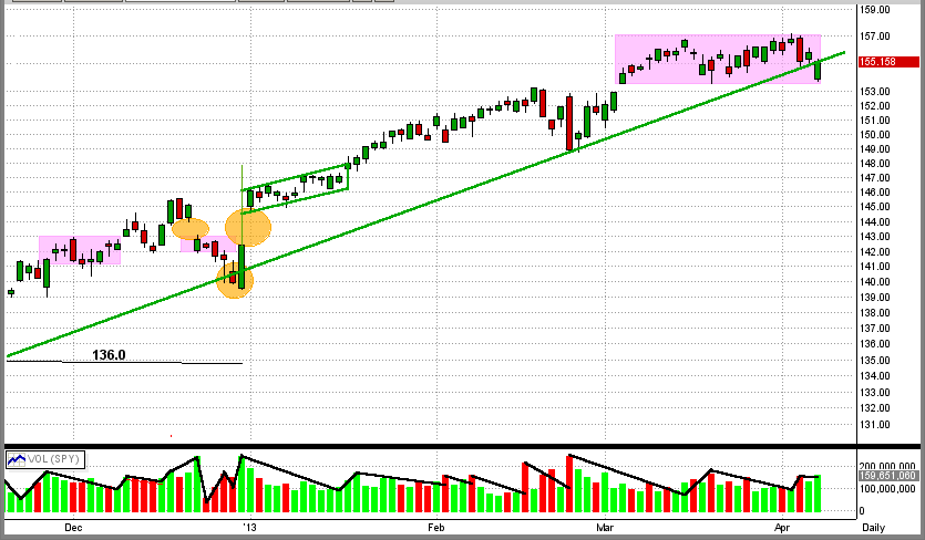
In our case, large institutional investors will not sit tight and let this go on indefinitely with no repercussions. Ultimately they will react. Thankfully, MIPS followers do not need to "call the market" themselves. MIPS will follow the market movements (mainly from the big guys by tracking volume), and will follow the new trend. In the last 4+ weeks, the SPY has moved sideways after breaking its all-time closing high. Usually, the size of market moves after breakout from a narrow trading range is somewhat correlated to the longevity of the flat trading range. This market can go higher with QE3 and little guys coming back into the market, but it is going to be an uphill battle breaking above the SPY price of $157.5/share (all-time intraday high).
See the graph below. The market (SPY) has been moving sideways for the last 20+ days (purple rectangle). The pattern of the market during this time has been a series of sizeable drops on relatively high volume (big guys), followed by a complete recovery over the next several days on low volume (little guys). Last Friday, the bears made a gallant effort to put a substantial dent in the market including a down gap on the open followed by a triple digit drop in the Dow, but the bulls spoiled the party by buying it back up to (and a little above) the intermediate-term trend line (long green line).
It’s anybody's guess from here, so we will depend upon MIPS to detect the next meaningful trend and tell us what to do.
|


