Thursday, September 25 2014
We all know that the stock market moves in "cycles", but many people cannot recognize them as such. To many investors, these cycles look like highly-volatile movements, but most really are just normal fluctuations. If you cannot decipher normal cycles as such and no more, you may not sleep well investing in the stock market. I personally learned how to do so over the years and thought that some of my tips may help you.
DAILY VOLATILITY
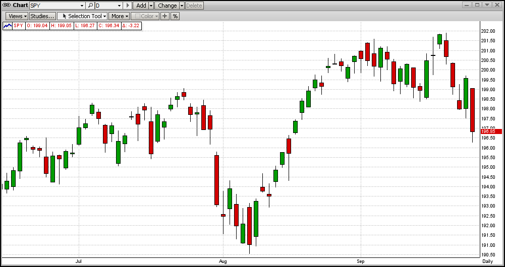
First, let's take a look at the moves in the SPY in the last few months (graph immediately below). The SPY movements in this graph are fairly representative of the last couple of years. Given that these "bars" represent your hard-earned money (retirement stash?), this can be unsettling. But, maybe it should not be. To see this more clearly, you need to step back a bit and look at it from a very different vantage point.
2-YEAR UPTREND
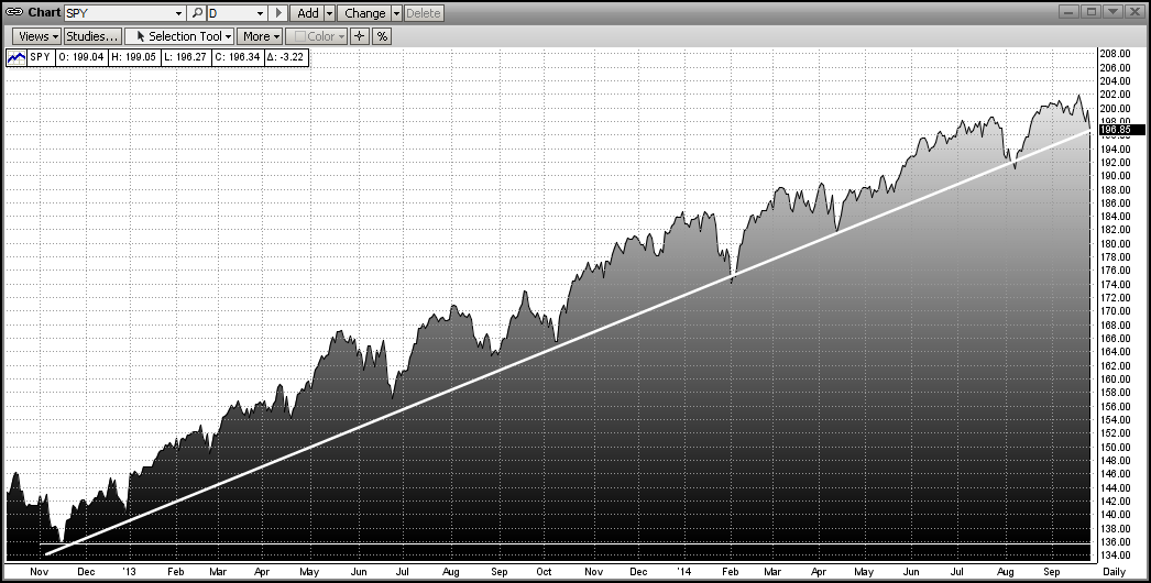
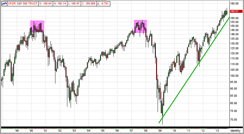
The graph below shows the price of the SPY since mid-Nov 2012 in a very different way (dark part). From this you can see a very definitive uptrend (white line). We all know that uptrends are made of higher-highs and higher-lows. The trendline in an up market is drawn along the bottoms of the higher-lows (just the opposite of being in a downtrend). Following the trend, this graph shows a 47% gain in the SPY (and, of course, in your money). BTW, if you had been trading 1/2 each of SPY/SH and SSO/SH (e.g., 1/2 double leverage on long signals), your gains would have been more like 65-70%.
Now, here is how you can sleep with this volatility: "Always consider the value of your portfolio to be the value on the trendline, no more". That is, do not consider the money above the trendline to be "your money" because the market is going to come back to the trendline over-and-over again until the trend runs its course. [What to do then is another topic in itself, and it entails knowledge and use of the MIPS models.]
MONTHLY GRAPH
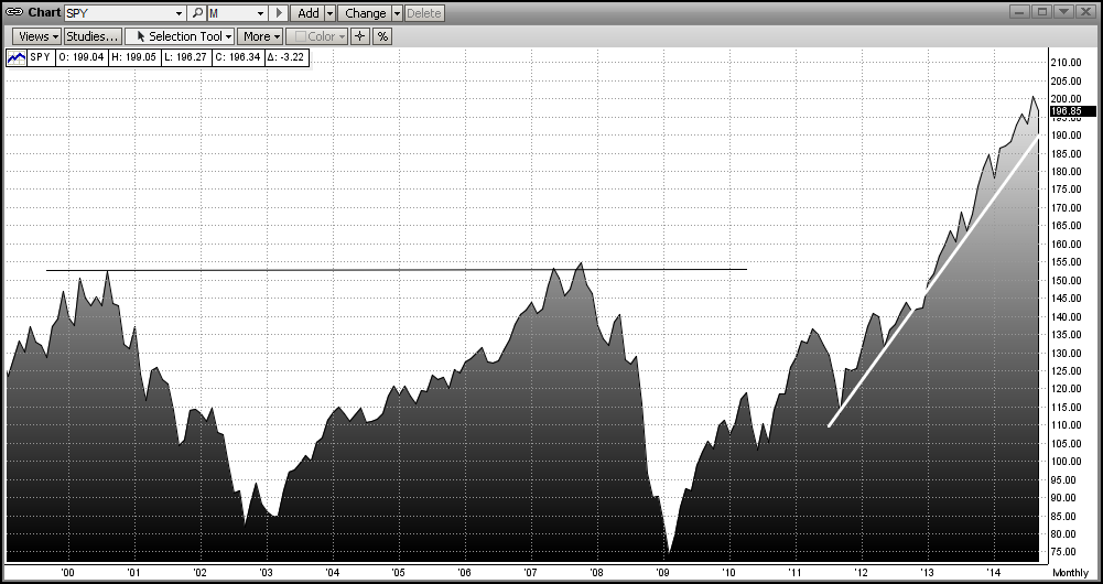
While you are enjoying watching the trend (and MIPS) making you money (or coming to an end), you can also sleep better at night along the way by looking at the same movements of the SPY on a weekly or even monthly basis. See the above trend on a monthly graph below (white trendline). Even if you look very carefully at the monthly graph below, you will NOT even be able to see the market volatility in the first graph above that kept you up at night. So, maybe you have been worrying about nothing !!!
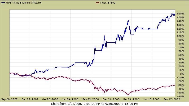
MIPS IN MARKET CRASH OF 2008
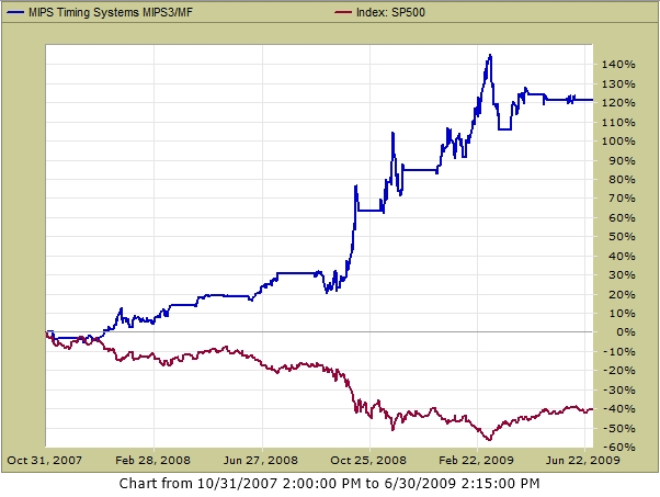
And again, don't be afraid of a market crash. Embrace it. Down markets are where MIPS should really make us big money, as it did in 2008 (see verified graph of MIPS3/MF trading SPY/SH from TimerTrac.com below).
Tuesday, September 23 2014
It is not really whether or not a market crash is coming, it's when. How do we know this? Because the big-bad-bear ALWAYS comes.
The very same "evidence" that Buy and Hold pundits (liars) use to prove that buy and hold works, actually proves that it does not !!! Their basic evidence is the "100 Year Dow" graph below. Upon close examination, starting with 1900-1920, you will see 20 good years followed by 20 flat/down years, over-and-over. BTW, being flat or "even" after 20 years is really a tremendous loss, because one would have doubled their money over 20 years with bonds paying only 3.6% !!!
From the graph below it would seem that, if people lived 100 years or more, the Buy/Hold liars may have a point. But most investors' prime "equity" investment years are from the time that they are say 45 years old (bought house, kids in college, career sound, etc.) until they are 65 years old (approaching retirement, need safe investments, more money in bonds, etc.). So, the prime time span for investors having a large portion of their portfolios in equities is about 20 years.
In the last 110 years, the 20 good/bad periods were:
Good 1900-1920 1940-1960 1980-2000
Bad 1920-1940 1960-1080 2000-????
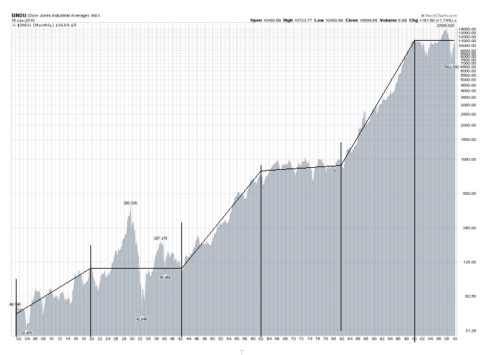
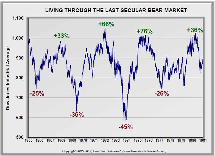
Almost everyone knows that the stock market in 1920-1940 experienced the biggest crash in the last 110 years, and we have personally "lived" through the market ups/downs in 2000-2013. But, what about the market in 1960-1980? For that, see the graph below. One could say that the graph speaks for itself.
It should be obvious by now that this leaves the time period 2000-???? to dissect. Will we have another big drop? If so, when? And, how fast will the market turn down and will MIPS catch the turn? My experience has shown the market crashes that result from bad fundamentals change slowly (long bubbles like housing, etc.), whereas crashes that come from surprise "events" (like Lehman Bros.) change quickly.
See the graph between 2000-2013 below. We all know (unfortunately) that we have had two big market drops of over 50%. You will probably be relieved to see that, at the top, these markets traded in a range of (+ and -) 5% of their market tops for 9-10 months, before they headed down fast !!!
How did MIPS handle the BIG market crash of 2008?
- Well, it started with a short call on 12/12/07 for a 12% gain, followed by 4 other profitable short trades.
- Total gain of about +40% on the last 3 short trades between Sep'08 - Mar'09) !!!
- See graph below. What, me worry?
Legend: Red Boxes = Short Signals; Green Boxes = Long Signals; Yellow Boxes = Cash
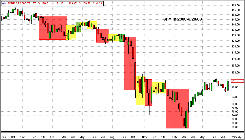
Graph below is the MIPS3/MF performance in 4Q'07 - 3Q'09 using "verified" trade signals on TimerTrac
Tuesday, September 23 2014
We are pleased to report that we had a large number of respondents to our recent "Survey" email (see Survey email below). Most were very passionate and confident about their vote. And, many of our MIPS members are seasoned investors and/or professional money managers.
Rounding off to the nearest 5%, the final vote was:
UP DOWN Don't Know
65% 30% 5%
Thanks for your inputs...
- and remember, no matter what we think, we do not personally have to be right to make money in the market
- we just need to follow MIPS !!!
Feel free to contact me with questions (10am-8pm CDT, 6 days/week)
Paul Distefano
===============================================================================


     <<< "Survey" email from 9/19/2014 >>>
          MIPS - Survey: S&P500 3000 or 1000 ???
MIPS Members:
Of course, it is possible that this market will continue up at least until the S&P 500 reaches 3000. On the other hand, it is just as likely that the S&P 500 will collapse all the way down to 1000 or lower.
This market is similar to the market in 1995, where the Nasdaq had risen 10-fold in the prior years from 1985. In 1995, everyone was crying bubble, bubble, bubble and the Fed Chairman Greenspan coined the phrase "Irrational Exuberance" (meaning 100% emotional behavior). So, where did the market go from there? It continue up 6-fold from 750 to over 4500 in the next five years !!! [See our previous email below from May 11, 2013 entitled " History Repeats Itself, Like 1995 or 2000?"].
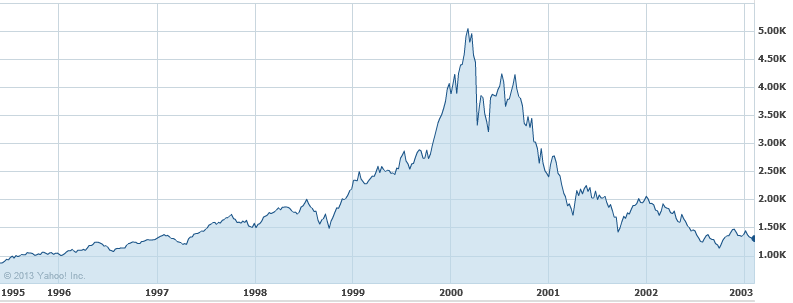
As one would expect, after the Nasdaq reached 5000 in the year 2000, the Nasdaq crashed big-time (65% drop) !!!
VOTE Up or Down in your email response
So, we would like your opinion as to whether we are:
1) in a market like 1995 where the market is going to continue up at least another 50% (to
a S&P 500 of at least 3000) or
2) in a market like 2000 where the market is going to crash at least 50% (to S&P 1000) ???
Thanks
Paul Distefano
=================================================================================
Saturday, 11 May 2013
As with almost everything in this world, the behavior of the stock market is made up of actions from millions of people. And, as with almost everything in this world, the stock market does kind of repeat itself. The $64,000 question is what is repeating and when?
This week I saw a talking head on CNBC discussing what was going on in the market and why, and if the current 5-year bull market would continue. Like most others, he gave a very nondescript answer. His short answer (and my interpretation of his answer) was that the action of the stock market would follow one of the options below:
1) Rational Exuberance - 60% (that is, keep going up as it should)
2) Irrational Exuberance - 30% (that is, going up faster, even though it should not)
3) Market Crash - 10% (that is, a complete reversal from today's bull market action).
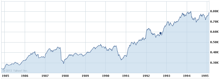
This reminds me of three market behaviors of the Nasdaq in the 1990's (when Alan Greenspan coined the term "Irrational Exuberance").
Graph 1 - Rational Exuberance
This graph shows the Nasdaq from 1985-1995, when the index TRIPLED, but did so because technology was booming. This fits "Rational Exuberance" because everyone was happily making money on the high growth of companies like Microsoft, Oracle, Cisco, etc. In this 10-year period, the Nasdaq rose in value from about 250 to 775, ending with "overbought" conditions, nose-bleed P/E ratios (Cisco had a P/E ratio of over 100), etc. Then, the pundits were were crying, GET OUT!!!
Were they right?
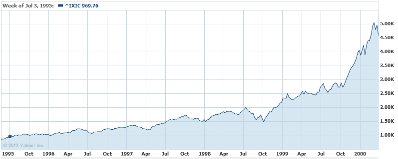
Graph 2 - Irrational Exuberance
Of course, the pundits were right about the fundamentals, but DEAD WRONG about the Nasdaq market performance
- the proof lies in the following 5 years performance [that is, in the time period of 1995-2999 (Graph 2)]
- this is when everyone (especially the little guys) went into panic buying ("Irrational Exuberance")
- the net result over this 5-year period was that the Nasdaq WENT UP OVER SIX-FOLD, from 775 to 5000, with
crazy things like Cisco's P/E ratio growing to over 400, Yahoo's market cap being more than the GDP of Iceland, etc.
Graph 3 - Market Crash
We all know that US stock market indices went up in smoke after the year 2000, but getting out in 1995 was way too early.
OUR POINT IS THAT SINCE THE MARKET DID RECENTLY BREAK TO THE UPSIDE AND SET NEW ALL-TIME HIGHS, AND IF THE BIG GUYS GET THEIR WAY, THE LITTLE GUYS CAN PUSH THIS MARKET WAY HIGHER THAN IT SHOULD GO (like 1995-2000), AND THEN THE BIG GUYS WILL DUMP BIG-TIME (like 2000).
BUT, IF THE LITTLE GUYS ARE NOT ABLE TO KEEP THE SPY ABOVE ITS CURRENT RESISTANCE LEVELS, THE BIG GUYS WILL MOST LIKELY SELL DOWN. OF COURSE, THIS CAN RESULT IN (1) A RELATIVELY SMALL DIP WITH A CONTINUED UPTREND, OR (2) A BIG MARKET CRASH (like 2000).
We certainly can't predict what will happen from here, and that is why we developed and follow the MIPS models. If and when this market makes a major change, MIPS will most likely miss a minor part of the change, but will find and follow the resulting trend. And, MIPS should ignore minor changes to prevent getting whipsawed.
Thursday, September 18 2014
Lots of action this week. Of course, Yellen is still doing everything she can to help the fat kats to get fatter. She claims that her efforts to drive interest rates to near zero are to boost the economy and to help the little guys, but we all know better than to buy that. If the Fed really wanted to help the little guys, it could have simply given each family in our country over $55,000 each (not practical, but we did print that much new money).
So, where did the money go? Of course, quantitative easing has helped the economy and the little guys some, but the real benefactors have been the top 1% who have funneled money to themselves en masse by borrowing hundreds of billions of $'s at near zero interest and "raking it in" with things like huge gains in higher-and-higher stock prices. For example, the process has been to:
(a) borrow at near zero interest,
(b) buy back company stock,
(c) profits/share go up because the number of shares go down, NOT because profits go up,
(d) stock prices go up both from the higher buying volume and the "higher" profits/share ratio,
(e) fat kats make big money on the higher stock prices of their personal shares, and
(f) fat kats get huge bonuses because "they" increased the profits/share.
And, there is still tons of money out there that has not yet found its way into the economy.
If will be very difficult for the stock market to collapse while this process continues and when there is really no other competitive place to invest big money with high liquidity.
See the graph immediately below:
What you see is the tail-end of a 19-month uptrend (black line), a breakout today to the upside from within a 3-week sideways trading pattern (pink rectangle), and a new high on the SPY at $201.70/share. Upside resistance is at the upper end of the green trading range, and downside support is at the 50-day EMA.
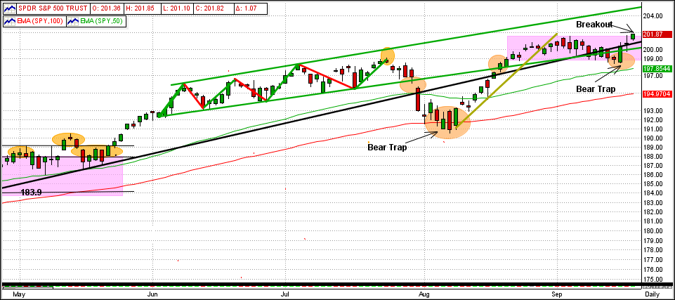
During this 19-month trend period, the number of MIPS3 trades has been very low due to the strong market uptrend (MIPS does not trade just to trade). The MIPS3/MF model usually trades 10-15 times/year, but it has only traded about 6 times since the end of 2012. More trades in a market like this usually result in getting whipsawed (as many other timing models have experienced).
So, how did MIPS3/MF perform during this time frame ???
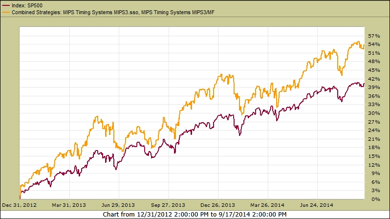
See the graph of MIPS3 below trading 1/2 each of SPY and SSO on Long signals (1.5x leverage) and 100% SH on Short signals (no leverage). During this time, MIPS3 was up +54% !!!
Wednesday, September 10 2014
This blog is an update to our previous 8/19/2014 email (shown below this current email). That was when the newest short-term trend, which started in late-May 2014, went into a big dip on 7/25/2014, and then started a recovery from this Bear Trap on 8/18/14, had just worked its way back into the green-line up-channel.
Since then, the SPY continued the up-trend for a few days (gold trendline) and then went into a 14-day sideways trading pattern (pink box). Today, the SPY "tested" the sideways pattern bottom (pink), the intermediate-term trendline (black), and the bottom up-channel trendline (green), and "held-the-line" on all three (see graph immediately below).
Legend:
Green Curved Line = 50-Day EMA
Red Curved Line = 100-Day EMA
Black Line = Intermediate-Term Trend Line
Green Lines - Short-Term Trend Lines
Purple Box = Sideways/Flat Trading Pattern
Orange Circles = Significant Points
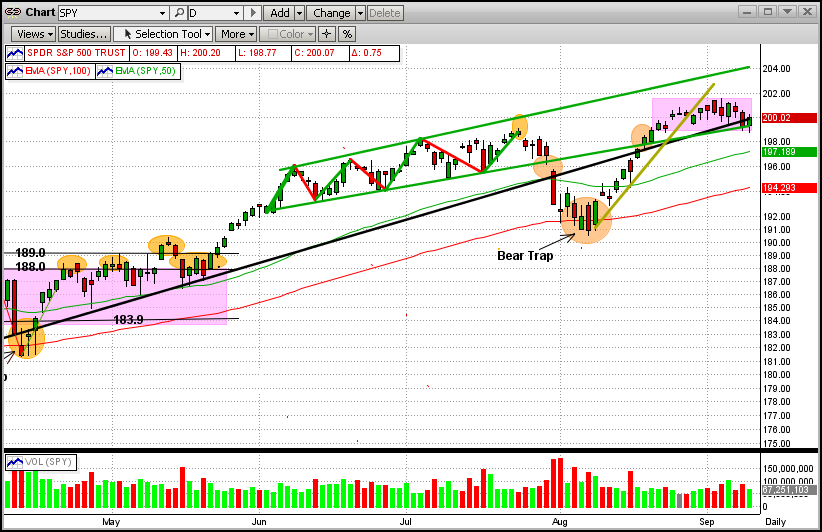
It is interesting that the majority of the times that a market goes into a sideways pattern, it breaks out the way that it went in (like now, the SPY entered the sideways trading pattern going up, so we expect it to break out to the upside). After that, the next upside goal is to break the upper trendline in the green up-channel trading range. On the downside, the SPY has support at both the 50-day EMA and the 100-day EMA (the latter of which lies about 3% below today's close).
The odds are for the uptrend to continue (the MIPS models all remain long at this time). We all know that this can change at any time and believe that MIPS will get us out when it does. So, sleep well.
|