Sunday, April 03 2016
Rightfully so, many MIPS members are concerned about curve fitting, data mining, etc., in timing models on the market today (and, or course, in the MIPS models themselves). I can tell you point blank that we do not curve fit in the development of the MIPS models. I can also say with a high degree of certainly that any engineer with an advanced degree from a good school who has written software for control systems (say for nuclear power plants, space rockets, fighter jets, commercial aircraft, etc.), where failure is expensive or disastrous, knows the difference between curve fitting and the development of new algorithms to improve their software's performance.
I say "rightfully so" above, because many (or most) model developers do curve fit in the "development" of their models (if you want to call it "development"). The problem is that "curve fitting" is not really "development". It is merely forcing a bad model to look good using a certain set of data. And yes, done correctly, that model may produce good results after curve fitting with a certain set of data, but will almost certainly fail with any other set of data. I can also tell you that I know several model "developers" that curve fit in some form or fashion in their models, and they don't even know that they are doing so.
In reality, there can be a fine line between:
(1) curve fitting an existing model to perform better or
(2) introducing new algorithms to make a revised model perform better than its predecessor.
Let's see if I can come up with an example of this. In many cases, trying to come up with an example to explain something is more complicated than describing the original.
Allow me to try to explain fixing a fighter jet's control system software to better adhere to the design specs as to how fast the jet should climb in relation to how far back the pilot pulls "the stick". In any decent software of this type, the formula would be based on the physical fact that, because of the curvature of the top of the wing compared to the flat bottom, the air traveling over the top of the wing goes faster than that along the bottom, and hence the air pressure on the top of the wing is lower than that on the bottom. This pressure difference, of course, is what "pushes" the jet up into the lower pressure zone. This is why the wing is designed and built the way it is.
Now, let's say the fighter jet isn't working the way is should and two teams set out to fix it. Team #1 applies curve fitting and team #2 chooses to redesign.
Team #1
Curve fitting in this case could be "developers" tweaking certain parameters in the existing formula to force the jet to climb at a certain rate depending upon the speed of the jet. They may make this one jet perform better, but their "design" will likely fail for all others.
Team #2
Real development in this control system software would be where the design engineers that developed the formulas for how fast the wind over the wing should travel, realize that these formulas were developed for Mach1 speeds, but the current jets travel at Mach3. They also know that, at Mach3, the faster wind speed heats up the air going over the wing more than Mach1, and this hotter air get "lighter" (lower pressure). So, lighter air on the top makes the pressure from the bottom more effective, and the jet moves up faster.
Therefore, rather than one-time random "adjustments" which are also unexplainable from Team #1 (the curve fitters), the "real" design engineers in Team #2 introduced new mathematical algorithms that take the speed of the jet into consideration and adjust accordingly and automatically, and the software then works again at all speeds.
The main difference between these two approaches, of course, is that, when the software controlling of the jet needs to be improved:
Team #1 members "need and use" the raw data to adjust/develop their model, whereas
Team #2 members introduce new mathematical algorithms to closer resemble the performance of the jet itself (and they use the data
only to "prove" that the new algorithms/equations did improve the performance of the jet in the way in which it was designed).
Is this understandable?
Saturday, April 02 2016
GREAT NEWS FOR MIPS MEMBERS !!!
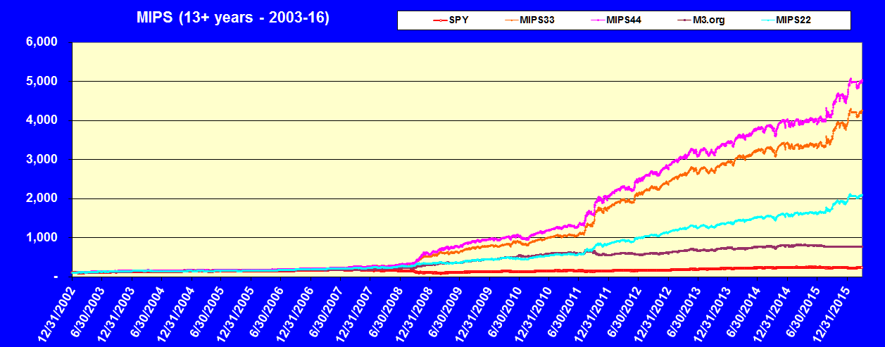
We have spent the last 15 months developing what has turned out to be some of the very best models on the market today. We call this version of our models the "Blaster Series". Even though we added many new algorithms that would make our models better, the main contribution is how we now handle "flat markets" (aka, sideways trading patterns, consolidation patterns, etc.). Call them what you will, but they wreak havoc on all types of timing models; partially because they are "trendless" and partially because these types of markets can change direction so frequently (every few days), that timing models available on the market today usually get whipsawed when trying to follow these patterns.
Therefore, we added new code in our MIPS models to successfully deal with:
(a) low volatility markets that "wiggle" either in a flat or very slow growing/degrading trend (2005),
(b) high volatility markets that shoot up/down in big cycles, and end up where they started (2011),
(c) high volatility markets that trade in a "very tight trading range" of plus/minus 3-5% and change
direction very frequently (like every 4-7 days, as in the first 8 months of 2015).
The results are a developer's dream:
Our tests of the new models show that, compared to the performance when we started developing this new series,
1) the CAGR of the Blaster models are 30-50% higher,
2) the Maximum Drawdowns have been reduced by about 35%, and
3) the average number of annual trades are about the same as, or a little less than, before.
Nomenclature:
Below are the names that we will use going forward to distinguish between the new MIPS "Blaster Series" models and the names of the prior models from which they came.
Pre-Blaster Models Blaster Models
MIPS1 No new model
MIPS2 MIPS22
MIPS3 MIPS33
MIPS4 MIPS44
MIPS/Nitro MIPS/Nitro5
Blaster Performance:
Tuesday, March 22 2016
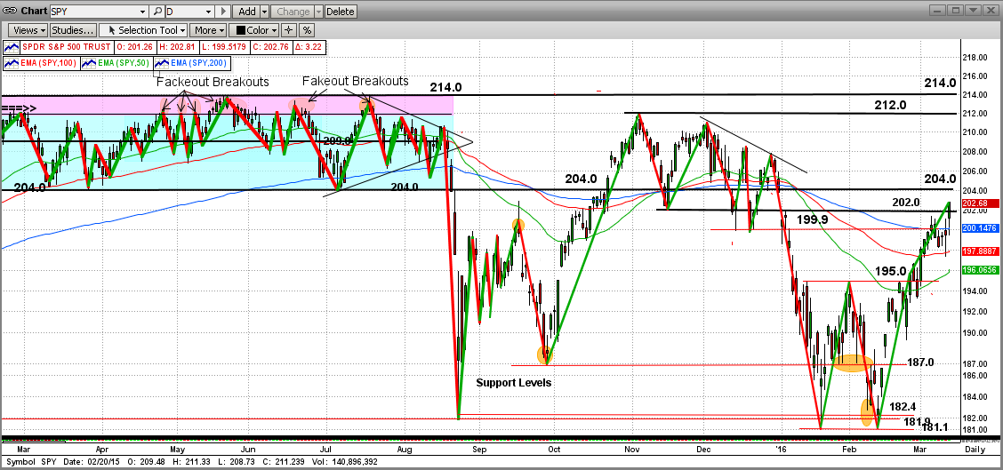
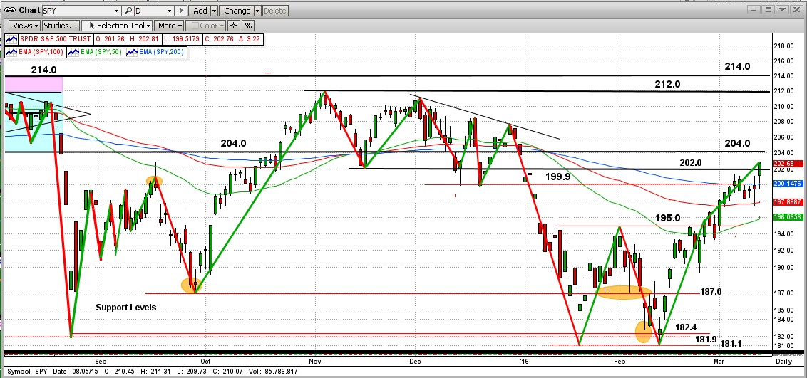
Many of our MIPS followers (including me) are asking if we will see new highs on the S&P 500 in the near future. We believe there is a good chance of that happening, but we are at a very critial point now.
As you can see in the graph below, the SPY broke through the top of an obvious double bottom at 195.0 (SP500 1950) in early March 2016, and then climbed rapidly to the bottom of the 12-month flat channel from 2015 at 204.0 (SP500 2040). The "area" between SPY 204.0 and 214.0 is what we have been calling "No Man's Land". The SPY broke through 204.0 with force (orange elispe), and has "stagnated" close to there for the last 3 trading days. It is very bullish that the SPY has been able to close above 204.0 every day after either opening or dropping below 204.0 intraday. Good "bounce-backs" for the bulls !!![Looks like someone hanging on to the top of a fence for their life, and it may be so for some of their investing lives.]
It will be very difficult for the bulls to push the SPY all of the way through "no man's land", up to strong resistance levels at 212.0 and 214.0 (SP500 2120 and 2140). The SPY all time high is at 213.5 (SP500 2135). And, of course, it will be even harder for the bulls to push the SPY through that level. Even if that does happen, none of this is really good for us unless the SPY keeps going up from there or we get out before the fall back. Read on...

Alternate:
If the bulls cannot push through SPY 213.5, we may be back to the topping process and the possibility of a big drop from near the all-time high. See below.
We will wait for MIPS to tell us how to trade this market...
Sunday, March 13 2016
With the recent price action in the stock market, one may ask if we are in a "New Bull Run" or a "Bear Market Rally" ?
If we look at the S&P 500 Index (or the SPY) over the last 12 months, this market does not look like it is going anywhere, except maybe up and down over-and-over again. Or, maybe even down, if not for the recent rally. The question is, "is this recent rally for real" or just a natural kick-back from a big drop (bear market rally)?
But, as active investors, we do not have the luxury to sit back and "only" analyze the market activity over the last year. We need to know where this market is going from here, now !!!
Read on...
In the graph below, you can see that after several drops and kick-backs, the SPY hit and bounced off of its strong support at the SPY level of 181.0 (SP500 1810) in mid-February of 2016.
Even though there were a few other hurdles along the way up, we (and everyone else on the planet) knew that the SPY would face its toughest upside resistance at the top of the double bottom pattern at 195.0 (SP500 1950). Needless to say now, the SPY broke through 195.0 with force at the beginning of Mar'16. That was really bullish !!!
So, where does this leave us? Since its breakout at 195.0 (SP500 1950), the SPY has managed to break through 202.0 and head for the nasty tight-trading "channel" where it "lived" for all of the first 8 months of 2015. This "channel" is between SPY 204.0 and 214.0 (SP500 2040-2140). If the SP500 actually hits 2140 (SPY 214.0), it will be at an all-time high, and then the sky is the limit.
But, since there are no guarantees, this market could easily fail in its attempt to reach a new all-time high, and head back down and turn into a real "market crash". Please understand that "this risk is not gone". We will leave that analysis up to MIPS. Stay tuned...
Monday, February 22 2016
Today, and over the last two months, the market (SPY) has formed an almost perfect "W" trading pattern (Google "M and W" trading patterns for more info). Some analysts call the M patterns double tops and W patterns double bottoms.
I agree with that at times, but not most of the time. Most times, I have seen the market break out of the M&W pattern in the direction that it went in (i.e., if it formed the pattern on a down trend, it usually came out to the downside, and vice versa.)
Also, we have seen these patterns repeat themselves for months, in which case I look at them as pure "sideways trading patterns" or "consolidation patterns" (up and down over-and-over in a tight range, as the market did for the first 8 months of this year). These are dangerous patterns and MIPS now has new algorithms to handle this or run to the sidelines and wait it out (i.e., minimize whipsaw).
But, now the SPY has formed a new W pattern and this time its anybody's guess. See the graph immediately below. The W pattern hit the bottom of its pattern twice at exactly 181.1 (1811 on the S&P 500 index) and got kicked back up both times by the bulls; and recently it hit the top of the pattern at 195.0 (1950 on the S&P 500) for the 2nd time and got slapped back below a little by the bears (for now). So far, this spells strong downside support at 181.1 and possibly strong upside resistance at 195.0. Read on below ...
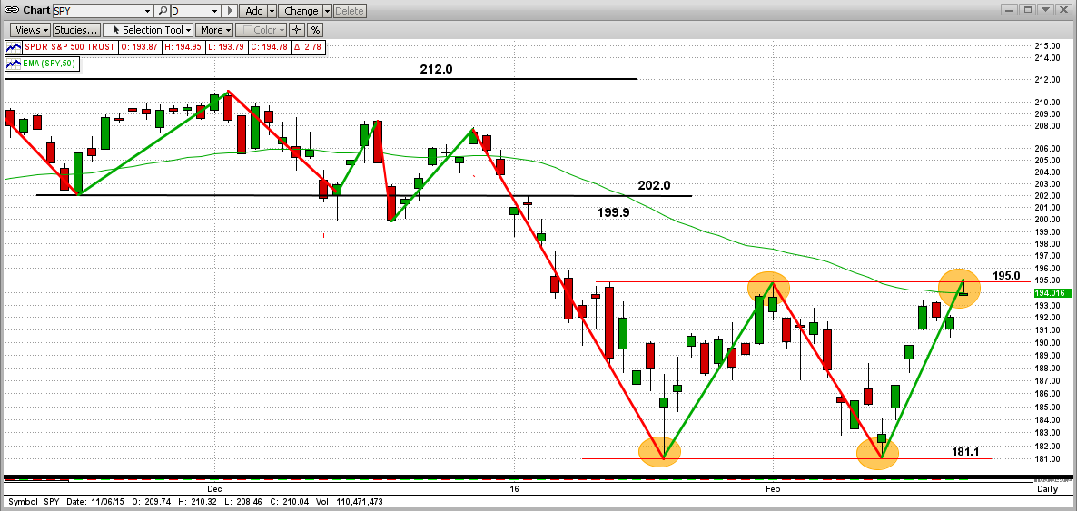
The next 2-3 trading days are crucial !!!
From here, if the SPY moves above 195.0 with force (and/or stays above it for a few days), we can look for the SPY to rally up to the next strong resistant levels at 202 or even 212. But, if it fails to break (and hold) above 195.0, we think the market (SPY) will drop back to test its support level at 181.1 (1811 on the S&P500). Then, if it breaks below 181.1, there is no strong support until way, way down (like in a real "crash"). My guess is that we may have a small rally from here, followed by a break to the downside below 181.1 sometime in the next 3-6 months. Follow MIPS, not me !
We are trusting MIPS to tell us what to do next, and I believe that MIPS will decide that shortly.
Stay tuned...
Monday, February 08 2016
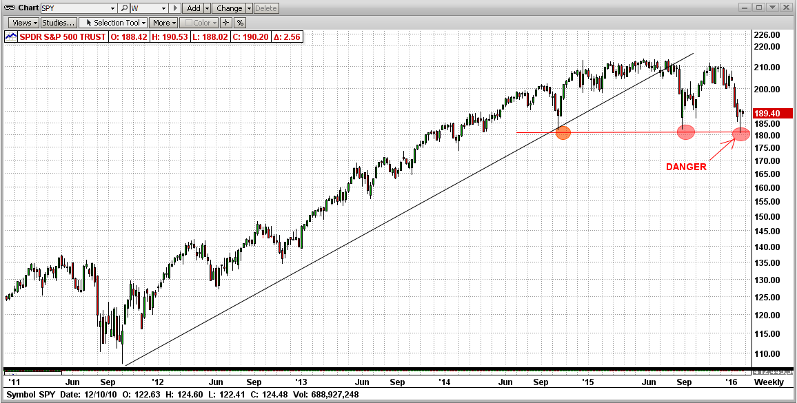
Please review our previous email below from 1/27/2016 (Beware the Bear !!!), or you may have trouble understanding this one.
In the previous email, we included a:
#1 daily graph,
#2 weekly graph, and
#3 monthly graph
in order to show how the SPY has been breaking all support to the downside starting at a high of 214.0 in 2015 (approx 2140 on the S&P 500). Today, the SPY broke to the downside through a very important support level at 187.0 that it had touched, and bounced back up from, 4 times in the last 8 trading days !!!
Today's breakthrough started with force (S&P500 down 50 points), but the SPY bounced back up after touching the next very important support level at about 182.4 (not a good sign for the Bears). In fact, this could be interpreted as a "one-day key reversal"; where the SPY could change direction and head back up from here for a while. Read on...
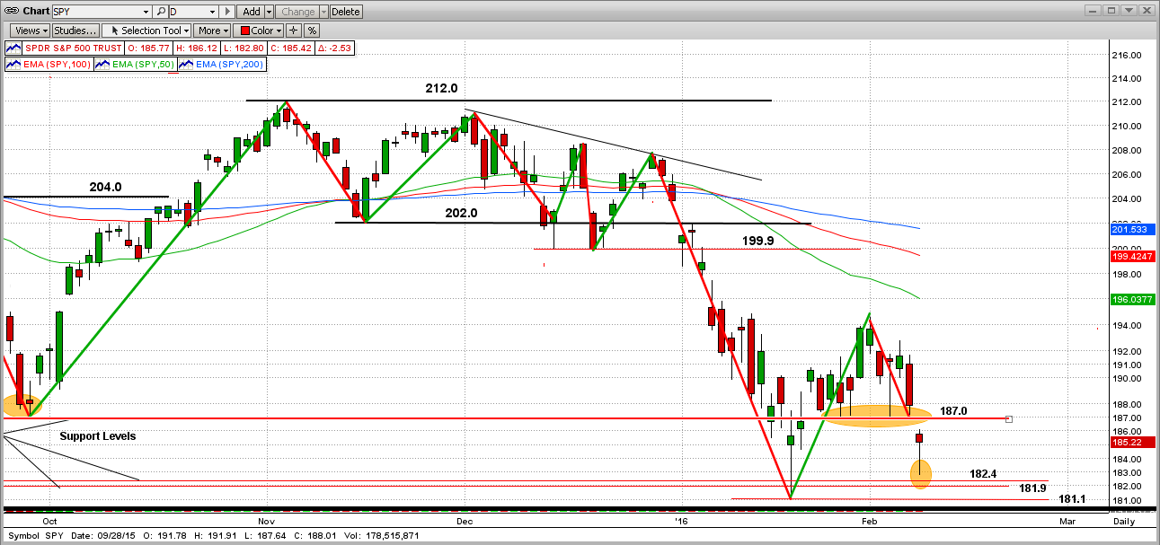
Or, maybe the bears will get aggressive and charge ("test") the last strong support level at 181.1. If the SPY does break below 181.1 with force (after 4 tries now) and stays below for a few days, this could be the start of the big drop we have been keeping you aware of. This, of course, would not be pretty for most investors, but MIPS is on the verge of a going short now, and would quickly identify and short the big drop. If this does happen, the graph below shows what the SPY could look like over the next few weeks/months.
Stay tuned !!!
Friday, January 29 2016
We may have unravelled the "Big Guys" selling plan !!!
- (where by may have I mean likely, but not absolute)
All we really had to do to unfold this was to follow "The Bear" on 3 trips toward its goal:
1) thru the daily path,
2) thru the weekly path, and
3) thru the monthly path.
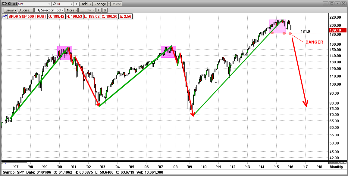
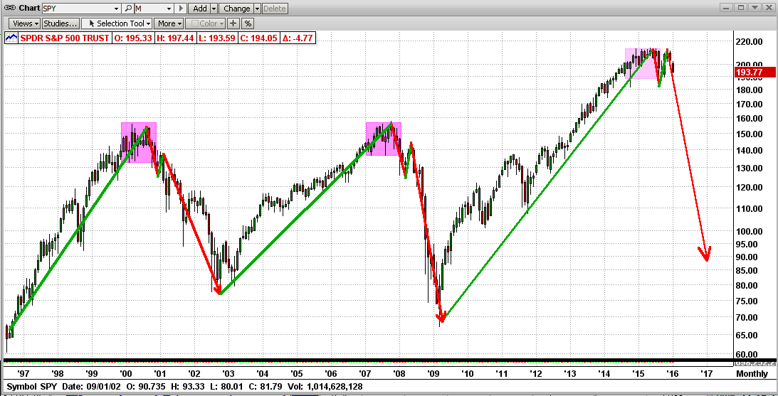
The Bear left very clear prints of where it had been and pointed out to us where it is most likely going. We don't need much of an explanation here, as the graphs below speak for themselves. Remember, the market moves in cycles and hits resistance and support levels along the way. For example, as a market travels a long way through an entire Bear market, it will meet (and need to break through) many support levels along the way. And, the support levels get harder to break through the further down they are.
So far, in the last 12 months the market has waffled back and forth for a record number of times for any prior 12-month period in market history, and has started what appears to be a big market drop. It could be a "correction" (drop of less than 20%) or a full-out "market crash" (i.e., a drop greater than 20%, and as far down as 40-60%).
The graphs below are:
Graph #1 - Daily graph,
Graph #2 - Weekly graph, and
Graph #3 - Monthly graph.
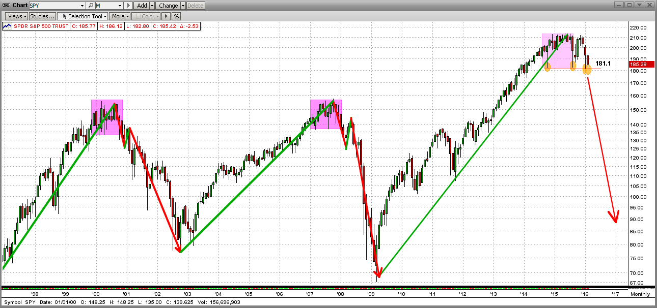
From its path in Graph #1 below, you will see that the S&P 500 (as represented by the ETF SPY), experienced an all-time high in May 2015 at 210.4 (about 2140 on the SP500 index) and has since broken key support levels on the way down at 204.0 202.0 200.0 187.0 182.0 and then it failed to break and stay below 181.0. In fact, the SPY failed to break and stay below 181.0 three times in the last 15 months (10/15/2014, 8/24/2015, and 1/20/2016).
Of course, this "Bear Path" is the work of the big guys. They try to hide their selling, but good technical analysis can expose them. The fat kats use volatility to try to "hide" their path; but again, good technical analysis can expose them. First we must make some sense out of the daily movements, and then the story gets more and more understandable as we move from the highly volatile daily graphs to the smoother, less distracting weekly and monthly graphs. In actuality, when we get to monthly graphs, the story is very obvious, clear, and telling.
In the past when similar patterns happened, the market has gone into full-fledged market crashes. Of course, that is just my personal analysis. But, MIPS is greatly different and is much more comprehensive. In addition to this type of analysis, MIPS uses other, much more comprehensive and reliable ways of determining which way the market is headed.
So, stay tuned and let MIPS guide us until the present plan runs its course.
- BTW, don't fear the Bear, as MIPS will take us short and we will greatly benefit from the market's
demise.
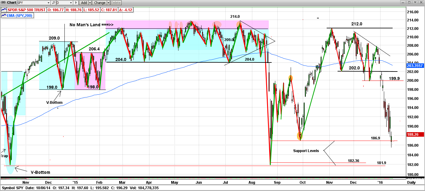
Graph #1 - Daily graph
See the 181.0 support levels at 10/15/2014, 8/24/2015 and 1/20/2016
- pink ellipses in the graph below
What I see here is strong support at 181.0
Graph #2 - Weekly graph
See the 181.0 support levels at 10/15/2014, 8/24/2015 and 1/20/2016
- pink ellipses in the graph below
What I see here is a broken trend and several strong attempts to crash (all failed at 181.0)
(Double Top ???)
Graph #3 - Monthly graph
See the 181.0 support levels at 10/15/2014, 8/24/2015 and 1/20/2016
- pink ellipses in the graph below
What I see here is a "topping" process that has run its course, with three attempts to break down hard, as in 2000 and 2008.
(Isn't it amazing that the volatility and waffling in all of Graph #1 is in the last three monthly bars below?)
Good trading !!!
Monday, January 18 2016
Is the Bear Upon Us?
We are smothered with "data and opinions" every day now that prove the market is heading for big trouble. This bad news is now centered around things like China's slowing economy and failing stock market (yes failing, not just falling); bad U.S. numbers on manufacturing output and retail buying; falling oil prices; fear that the Fed will reverse its course and start QE again, etc. Even if we knew for sure that all of this reported data was accurate, we would still not be able to figure out the impact on the stock market.
So, what good is this data if it cannot help us decide how it will affect the market. I am not sure about that, but I do think that there is an "indirect" way we can participate in the correct market moves. Institutional investors like Goldman Sachs, Morgan Stanley, UBS, etc. (the "fat kats") all have large staffs of hundreds of "Analysts" that analyze this data for them. Please understand that whatever actions the fat kats implement from their Analysts' recommendations are almost always 100% accurate, if you measure "accurate" by whether or not the market moves the way the analysts said it would. Well folks, if the fat kats buy, the market goes up whether or not it should; and if the fat kats sell, the market goes down whether or not if should. In other words, the price action of the market "follows the money".
This is not because the fat kats know which way the market should be going, it's because the market moves the way the fat kats push it (fat kats buying leads to up markets, and fat kats selling leads to market drops).
So, since we cannot predict the way the market will move, we seek to identify the way the fat kats are trading (buying or selling) and mimic them. MIPS capitalizes on this the by using "volume weighted data", where price action on high volume has a greater impact on the MIPS models than price action on lower volume.
[About a month ago we wrote a blog entitled "Is the Market Topping?" This was about how the fat kats "dump" their positions when the market is "topping" (i.e., turning from a bull market to a bear market). See http://www.mipstiming.com/blog/view/8682/is_the_market_topping_]
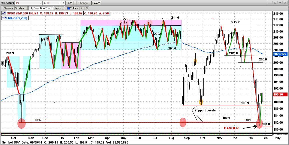
We actually thought that there was a good chance that the market was topping then, and we think so even more now. In the graph below, you can see that we have recently ALMOST completed this latest topping cycle, like the cycles from the start of previous Bear Markets (in 2000 and 2008); including two drops below the SPY's 200-day EMA (where "ALMOST" is explained below this graph).
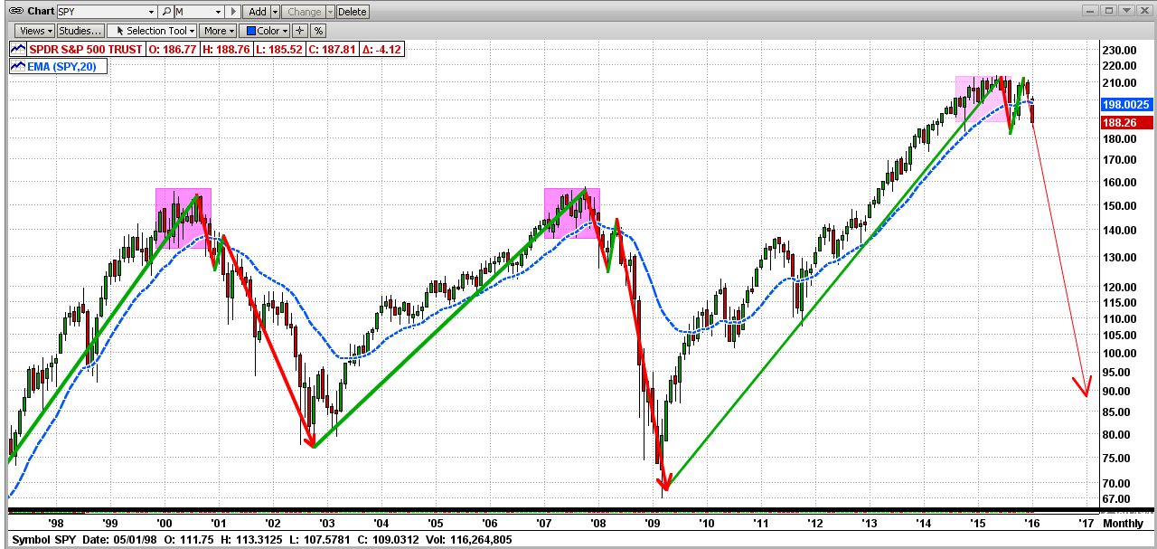
"ALMOST"
I used the word "Almost" above because there are a couple of things that have to happen before I would "bet-the-farm" on the big crash starting now !!!
The main requirement for the big crash to happen soon is that the SPY has to break through several more very strong "Support Levels" (see graph below). As you can see, so far the SPY has broken support levels at 202.0 on 1/04/16, and 199.9 on 1/06/16. Then the SPY dropped all the way down below the even stronger support at 186.9 on 1/15/16 (Friday), but closed above that level at day end. That could signal a reversal.
To turn into a market crash, the SPY still needs to break through strong resistance at 186.9 and 182.36 and finally at 181.9. Seems like quite a task, but the lower support level at 181.9 is only about 3% from Friday's close. Even if this all happens in the next few days/weeks, the bulls could still want this market to "top" for several more months before giving in to the bears.
BTW: MIPS3 and MIPS4 went to cash on 12/30/15, and short on 1/08/16...
Stay tuned...
Saturday, January 09 2016
To successfully manage their "Nest Egg", everyone needs a good "Asset Allocation" plan. An Asset Allocation plan defines how much of your life savings you plan to allocate to real estate, commodities, equities, bonds, alternate investments (art, etc.), and cash.
This "lesson" is limited to how to go about investing your equities money (i.e., stocks, ETFs, etc.).
Needless to say, most individual investors do not do well investing in equities, especially the ones who manage their own money. Some use RIA (Registered Investment Advisor) firms, and hope for the best because they have no idea how the firm will manage their money. Still, that is a better approach than trying to trade against the pros by yourself.
This lesson is for individual investors who manage their own money (that is, buy-and-hold or trade for themselves). Please be aware that there is no real, concrete definition of a "Buy-and-Hold" strategy. For example, does it mean to pick, say, 30 stocks (as in the Dow) and hold them for retirement or for your kids/grandkids? If so, you would not have done well in the past, because most of the stocks in the Dow fifty years ago are gone.
And, the Dow has NOT been made up of the same 30 stocks for many years. When one of the Dow stocks goes bankrupt (like FW Woolworth), the Dow replaces it with another (like Walmart). Thanks. If I had a brokerage firm that would do that for me, I would buy-and-hold with them.
And, what about buying-and-holding say 10-15 mutual funds? Do you think that the fund management team is not trading in those funds. Many "turn over" 50-100% of their portfolio every year. Does buying a fund and letting the managers trade their butts off with your money in their fund make this a buy-and-hold strategy? Why is that different than you trading those stocks yourself? Does buy-and-hold mean that, if you buy a basket of stocks (as in a fund), and let someone other than yourself trade those stocks all year long (while you watch from the sidelines), that makes it a buy-and-hold strategy? But if you make those trades yourself, NOT ?
Anyway, most individual investors do trade, but it is at random and is usually the opposite of what they should be doing. I know, because I did just that myself for over 20 years. We watch Apple go up like a rocket and THEN we buy in. Shortly thereafter, Apple dives, and we switch to another stock that has been skyrocketing, like Amazon. Then we do the same thing with Amazon and Google, etc., over-and-over.
Most individual investors do the same thing with timing models as explained above for stocks. They subscribe to one model, and if it takes a relatively small "hit", they change models and continue the same process, over-and-over.
We are almost guaranteed to not do well in the stock market without two basic principles:
1) a good, specific strategy (like how, when, what to trade), and
2) the discipline to follow through with our strategy, WITHOUT emotion.
I am going to tell you how to implement something like that above and show you one way to improve on what you have been doing; in some cases by 400% or more... read on.
First, let's assume that we would be content with buy-and-hold if we could find high quality "Indices" in the world that would perform 3-4 times better than the S&P 500 (or its ETF, SPY) over say an 8-10 year period, with less than 1/3 of the drawdown of the SPY. Would that be a correct assumption? And, would you trade a little to accomplish this? If so, read on.
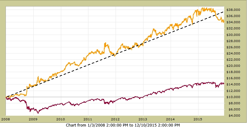
Let me show you what could be 3 of those types of ETFs from other countries on our planet (or something else) that performed as above. But first, let's establish the performance of our benchmark (the SPY).
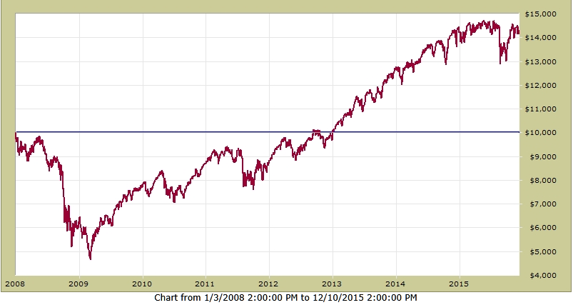
In the graph below, you will see that from 2008-2015, buying-and-holding the SPY would have:
1) grown a $100,000 investment to $143,000 (multiply right-hand scale by 10)
2) produced a compounded annual growth rate (CAGR) = 4.5%
3) experienced a Maximum Drawdown = -53.5%
Could we have found other investments that would have beaten this significantly? OK, let's look at some other investments that we present herein say as "Indices" from other high-quality countries. See 3 of those below:
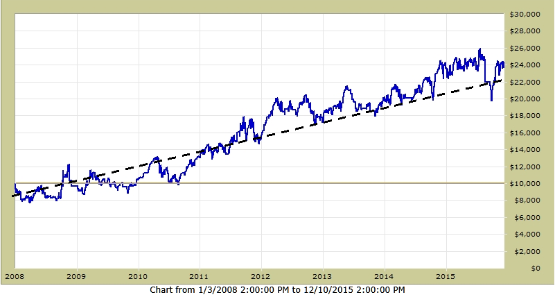
Country A - from 2008-2015, buying-and-holding the Country A Index would have:
1) grown a $100,000 investment to $240,000 (multiply right-hand scale by 10)
2) produced a compounded annual growth rate (CAGR) = 13%
3) experienced a Maximum Drawdown = -28%
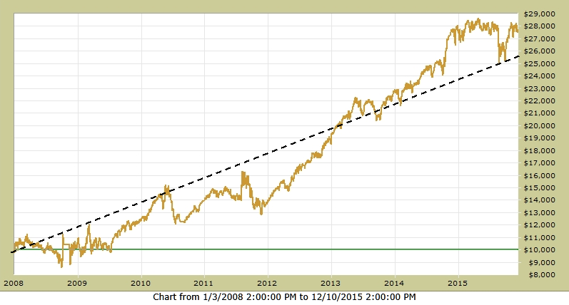
Country B - from 2008-2015, buying-and-holding the Country B Index would have:
1) grown a $100,000 investment to $280,000 (multiply right-hand scale by 10)
2) produced a compounded annual growth rate (CAGR) = 14%
3) experienced a Maximum Drawdown = -24%
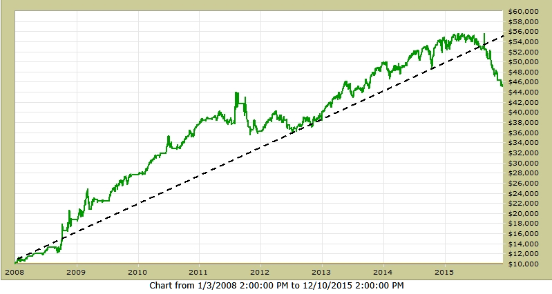
Country C - from 2008-2015, buying-and-holding the Country C Index would have:
1) grown a $100,000 investment to $450,000 (multiply right-hand scale by 10)
2) produced a compounded annual growth rate (CAGR) = 21%
3) experienced a Maximum Drawdown = -19%
MIXING
Our investment strategy would be to diversify our risk by placing a portion of our total equity money in each of these Indices. By investing 30% of our equity money in Country A; 30% in Country B; and 40% in Country C, the performance would be:
Combo - from 2008-2015, buying-and-holding the Country Indices and "mixing" as above would have:
1) grown a $100,000 investment to $350,000 (multiply right-hand scale by 10)
2) produced a compounded annual growth rate (CAGR) = 17%
3) experienced a Maximum Drawdown = -16%
Combo is Gold; Country A is Blue; Country B is Light Brown; Country C is Green
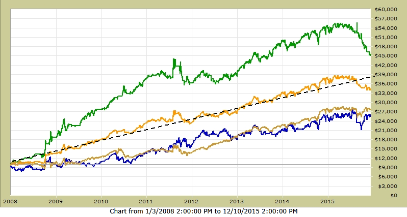
Compared to buying-and-holding the SPY, the above strategy of "mixing" good indices does MUCH better, with VERY LITTLE RISK (Max DD=-17% vs -53% from the SPY)... see below !!!
Now "The Lesson"...
First, I have some bad news and some good news !!!
The bad news is that, even though the graphs above are "verified" actual performance, they are NOT Indices from other countries (sorry, but I needed to do that to get and keep your attention).
The good news is that the results in the graphs above (that are reported as from Country Indices) are from actual good, live models like MIPS. To make my point, I used MIPS3 as Country C and picked two other models from developers that I know that have verified results on TimerTrac.com for over 10 years. I know others (like on ThetaResearch.com) that are as good or better than the other two presented herein.
My point is that many individual investors who can tolerate 40-50% drawdowns from buy/hold of good mutual funds or from a group of large-cap stocks in the US or Europe, cannot seem to tolerate even a 20% drawdown from a timing model (or better yet, a combination of 2-3 good models) even though these models have outperformed the Indices/Funds by 300-400% !!!
Caution:
Please be aware that you cannot just pick 2-3 good timing models, mix them, and expect to get similar performance and lower drawdowns from the "mix". To get lower drawdowns, the individual models CANNOT be based on the same principles (like trend-following, reversion to the mean, sector rotation, etc). When the models are based on different principles, most of the time they have their "bad periods" at different times and this "smooths" the performance. For example, if you were using 3 models and one of them had a -15% drawdown when the other two were flat, the resulting drawdown for the "mix" would only be -5%. Etc, etc, etc...
Going Forward:
I am not in a position to "recommend" other models but I can tell you what to look for. And, we have several RIAs that use the MIPS models "mixed" with 4-5 other very good models, and their results have been amazing. I can introduce you to them. Feel free to contact me !!!
Paul Distefano, PhD
CEO / Founder
MIPS Timing Systems, LLC
Thursday, January 07 2016
"Topping" is when the big guys are selling at a market top over a 12-15 month period; and when they have offloaded most of their huge long positions, they start shorting and driving the market through the floor.
The way this works is that an institutional investor decides to dump, say, 200 million shares of GE. Every week or so, they sell their GE position all the way down between $28 to $23/share, and they depend on the little guys to "buy on the dip" and drive the stock price back up from $23 to $28/share, over-and-over again.
The process ends when the big guys have sold most of the long positions that they wanted to unload. And, when the process does end, the market crashes (down 45-60%).
See the last two crashes below (2000 and 2008) and beware. Please see that the bars in the graph below are monthly bars, so the topping process took 12-14 months in these two years. Looks like the same is happening in 2015-16.
There is no reason to panic, mainly because once these shrinking markets start dropping, they take at least 12-18 months to run their course (i.e., for the Dow to drop like 7,500 points). We just need to wait until MIPS sees the big crash actually happening and takes us to cash and then short.
Of course, this crazy market could turn around and roar back up...
Stay tuned !!!
|


