Tuesday, July 01 2014
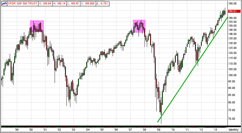
Many investors think that the bull market that resulted from the massive market crash of 2008 is over, or very near its end. That is highly possible, of course, but NOT a certainty. Many individual investors are basing their opinions on the bull market "recovery" between the two market crashes in 2000 and 2008.
See the 1st graph below:
The bull market between the bottom of the 2000 crash (in 2003) and the top of the resulting bull market in 2007 lasted 5 years. And, the bull market since 2008 is already older than 5 years.
Also, in the 20-year-period between 1960-1980, the stock market experienced 5 crashes of 35% or more
(4 year averages). => http://www.mipstiming.com/behavior
So, is it not time for another market crash?
SPY Between 1998-2014
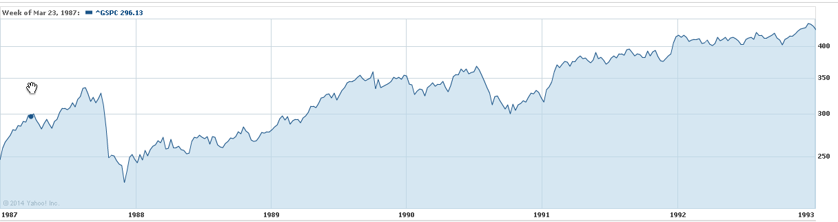
Maybe so, and maybe not. If you follow the market "logic" in the 2000's, a market crash is definitely due. But, let's look back at the most recent crash before 2000. This would be the notorious crash of 1987.
See the first 5 years after the crash of 1987 in the graph below. Using the "2000" logic above, this market recovery would have run out of steam at or near the end of 1992. But, did it ?
SPY Between 1987-1993
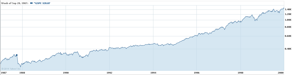
As can be seen below, this 1988 bull did not quit running until the end of 1999 or beginning of 2000
(12 years after the crash of 1987) !!!
SPY Between 1987-2000
So, history shows that bull markets (like our current 2009 bull market) do NOT necessarily have to stop running up because they are "old" after just 5 years.
The moral of this story is that:
1) it is very difficult to arbitrarily call the end of either a bull or bear run,
2) the MIPS models are very good at finding "Market Inflection Points" (when markets change direction), and
3) since the MIPS models work as well (or actually better) in down markets as they do in up markets, we need to quit worrying about "market crashes" (and, in fact, welcome them).
Our belief is that this 5-year bull run will continue for some time (but probably not 7 more years). And, we will see "corrections" on the way up. Of course, this is only my personal opinion, and we will follow (as you should) the much "smarter" MIPS models.
Saturday, June 07 2014
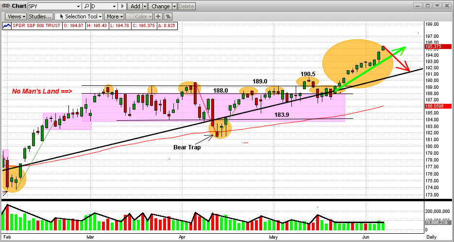
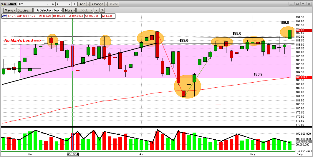
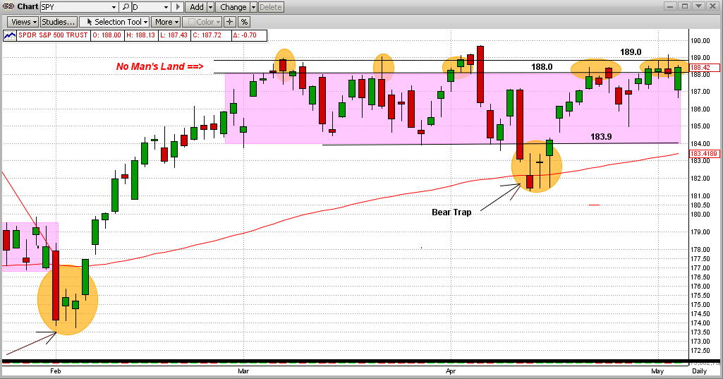
After six failed attempts in a three-month sideways trading pattern, the market (the SPY) finally broke out to the upside from inside a "No Man's Land". And, what a breakout it has been! In the graph below, you can now see a new, powerful up-trend (green line).
It seems that this breakout has, so far, followed the tradition for sideways/flat patterns, that is:
1) markets usually breakout of a sideways pattern in the same way that they entered (i.e., if the market was moving up prior to the sideways pattern, it will usually break out to the upside and vice versa), and
2) the length of time that the market will follow the resulting move and the size of the resulting gains/losses is closely correlated to the amount of time that the market traded in the tight pattern.
My opinion on the reason for #2 above is that after a long battle, the losers (in this case, the bears) quit trading and go away for a long time. I also believe that this is how the market (like now) can make sizeable, sustainable gains on relatively low volume (little or no competition).
It seems that the most likely direction of the market from here is up. But, even though it could, this does NOT mean that the market will follow the green-line trendline in the graph below going forward. It's just as likely that the SPY could drop back some or go sideways until it hits the long-term trendline (black line in graph below), and then follow that trend up going forward. That would be like a "reversion to the trendline". Either way, we make money.
Also, do not rule out a correction after these healthy gains. It is not what I expect, but MIPS does not pay one bit of attention to my expectations. If the market does somehow unexpectedly drop from here, MIPS will get us out.
===================================================================================
<<< Previous Blog >>>
For some time, we have been talking about this war between the Bulls and Bears, but we never really defined it. We call it a war, because that is what it is like.
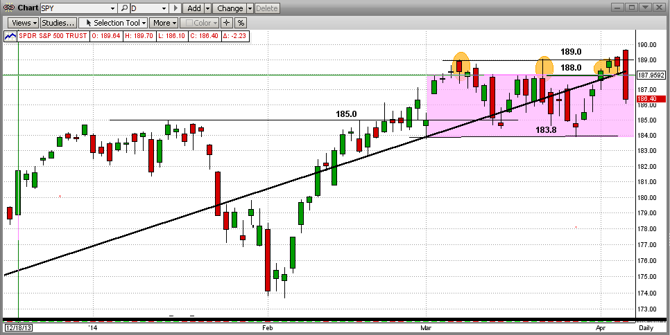
To help explain this, let's refer to the "Battleground" map below, with the following "definitions".
1) The SPY numbers ($188/share) are kind of like "mile markers".
2) The main battlefield is the purple area between markers 184 and 188.
3) The first wall of resistance in the battle is at 188 and the absolute "stone wall resistance" is at 189.
4) Between 188-189 lies an area that we call No Man's Land, that is deadly to try to cross or occupy.
It is like the Normandy Beach in WWII, the Shenandoah River in the Civil War, or a "moat" in the
Middle Ages. The casualties in this "zone" are almost unbearable, but sometimes attackers manage
to cross it. (Like now?)
So, using the above definitions, the History of the Battle of No Man's Land is:
1) Let's say the green bars are attacks by the Bulls and the red bars are retreats.
2) The Bulls attacked the Bear's first resistance level at 188 in the first week of March 2014 and then
pushed through No Man's land to 189 before getting stopped, routed on 3/13/14 and pushed back
to about 183.5 by mid-March.
3) Then there were 5 more broad attacks during the battle (orange ellipses).
4) The Bulls camped at the 188 level or hunkered down in No Man's Land for 26 days/nights in this
2-1/2 month battle.
5) The Bulls hit or broke over the wall at 189 nine times in this battle and failed every time, except on
its ninth try (today), where it stopped at 189.8.
6) One major problem is that the breach today above 189 came on low volume (kind of like the Bear's
super troops were not in this battle).
7) Now it is up to the Bulls to "hold their ground" and/or capture more territory, while the Bears must
concentrate on re-claiming the territory that it lost today.
The Bulls should not celebrate until the market moves higher or at least they retain what they have gained so far.
Our MIPS Market Strength Indicator is strong to the upside now, but we all know that this can change quickly.
- see 2nd graph below.
Remember, MIPS may see this somewhat differently, so let's wait for MIPS' signals.
Battleground Map
Sunday, May 25 2014
During most of 2013 and 2014, we have received emails from MIPS members wanting to know why the MIPS models stayed Long for so long without often going short. This was due to the fact that our MIPS3/MF model, for example, traded only 2 times in 2013 and 2 times in 2014, the lowest in the MIPS3/MF eight-year-plus history.
When asked why they thought that MIPS should have traded more often, they mainly said the "volatility in the market" (as in the SPY). On the surface, I can certainly see why they would feel that way. See the graph below. From this, it looks like there were several good opportunities to short, but the risk of getting whipsawed in a market like this is very high. In fact, many timing models did get sucked in to short positions several times, only to get whipsawed almost every time.
It is very difficult to ascertain from the "surface" of a price action graph where the market will go next or what the underlying strength of the market is at any point in time. This is one reason why MIPS provides its proprietary Market Strength Indicator (MSI) graph on its website for MIPS members at:
=> http://www.mipstiming.com/msi___mips_members .
Even though the human eye and mind may have trouble "reading the tea leaves" from the price action of the market on a bar chart or other graph, the underlying mathematics and intricate indicators in a " very good" timing model see things differently, and have a much better chance at interpreting the most likely direction of the market in the short term. Of course, you never want to bet against the trend. By a "very good" timing model above, we mean a timing model that has sufficient built-in "coverage" of the movements in the market to arrive at sound decisions going forward. This means timing models with enough math and enough technical indicators to work well at least in slow up-markets, fast up-markets, slow down-markets, fast down-markets, and flat/sideways markets. This CANNOT be done with any degree of consistency or accuracy with a timing model (if you could even call it that) that is made up of simply 6-12 "off the shelf" market indicators. On the other hand, a timing model with, say, 100 or more published and/or proprietary market indictors does have a good chance to be consistent in calling the market trends correctly. Even then, the degree of accuracy of a model like this depends on how well the various indicators are "matched" with each other, how the model's voting algorithms are designed, the degree of self-learning/self-correcting capability of the model, its ability to identify certain market patterns that cause timing models to waver, etc.
To show a simple example of what the guts of a market timing model looks like, the graph below is an X-ray view of part of the MIPS3 model. This is how some of the internals of the MIPS3 model see the raw price data from the first graph above. [This is a visual illustration of just a very small fraction of the internals of the MIPS3 model.]
In the graph below, the top straight line is a long-term trend line and the colored lines come from things like moving averages and other trend lines, or combos thereof (the up-trends here are obvious). The three indicators in the bottom half of the graph below come from things like various slopes of the SPY price, proprietary rate-of-change, modified relative-strength-index, and various mixed oscillators. In all cases, the indicators are "Long" when they are above the zero line, and "Short" when they are below zero.
Hence you can see that, even though the first graph above seems to show various opportunities to go "Short", the majority of the internal MIPS3 indicators in the graph below have been highly bullish throughout the entire period. Ditto for the rest of the MIPS3 model. Therefore, the real reason why the MIPS models have stayed Long for the majority of 2013 and 2014 is that the up-trend was very strong the entire time period and so there were no good reasons to trade otherwise (i.e., don't fight the trend) !!!
This is not to say that the market cannot go south quickly. It can, but the guts of the MIPS models can also change quickly. History has shown that the MIPS models react quickly to big market crashes and/or corrections.
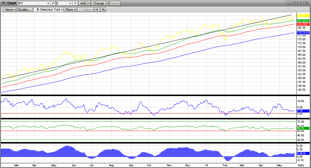
The above is similar to the process followed by doctors who examine patients who come in with obvious "markers" on their body (welts, sores, moles, bruises, coated tongue, yellow eyes, unusual skin color, etc). If the patient's condition is not obvious from the outside, doctors resort to modern-day medical equipment that allow them to look deep inside of a patient's head, heart, back, stomach, etc. (like using X-rays, EKGs, CAT scans, MRIs, colonoscopies, etc). MIPS sort of behaves in a similar way.
So, instead of just looking at the surface data and guessing, we have the guts of the MIPS models to break down every movement of the market into segments, and to examine each one separately to come up with a consensus.
Monday, May 12 2014
For some time, we have been talking about this war between the Bulls and Bears, but we never really defined it. We call it a war, because that is what it is like.
To help explain this, let's refer to the "Battleground" map below, with the following "definitions".
1) The SPY numbers ($188/share) are kind of like "mile markers".
2) The main battlefield is the purple area between markers 184 and 188.
3) The first wall of resistance in the battle is at 188 and the absolute "stone wall resistance" is at 189.
4) Between 188-189 lies an area that we call No Man's Land, that is deadly to try to cross or occupy.
It is like the Normandy Beach in WWII, the Shenandoah River in the Civil War, or a "moat" in the
Middle Ages. The casualties in this "zone" are almost unbearable, but sometimes attackers manage
to cross it. (Like now?)
So, using the above definitions, the History of the Battle of No Man's Land is:
1) Let's say the green bars are attacks by the Bulls and the red bars are retreats.
2) The Bulls attacked the Bear's first resistance level at 188 in the first week of March 2014 and then
pushed through No Man's land to 189 before getting stopped, routed on 3/13/14 and pushed back
to about 183.5 by mid-March.
3) Then there were 5 more broad attacks during the battle (orange ellipses).
4) The Bulls camped at the 188 level or hunkered down in No Man's Land for 26 days/nights in this
2-1/2 month battle.
5) The Bulls hit or broke over the wall at 189 nine times in this battle and failed every time, except on
its ninth try (today), where it stopped at 189.8.
6) One major problem is that the breach today above 189 came on low volume (kind of like the Bear's
super troops were not in this battle).
7) Now it is up to the Bulls to "hold their ground" and/or capture more territory, while the Bears must
concentrate on re-claiming the territory that it lost today.
The Bulls should not celebrate until the market moves higher or at least they retain what they has gained so far.
Our MIPS Market Strength Indicator is strong to the upside now, but we all know that this can change quickly.
- see 2nd graph below.
Remember, MIPS may see this somewhat differently, so let's wait for MIPS' signals.
Battleground Map
MIPS Market Strength Indicator (5/12/19140
===============================================================================
<<< Previous Blog >>>
MIPS Members:
On yesterday's close, the SPY again stuck its head above 188.0 into No Man's Land (e.g., between 188.0 and 189.0). In fact, there is a very interesting phenomenon going on in this very tight range. Let's look at the stats from the graph below.
1) The SPY has been in a rather tight, sideways trading range since 3/03/14 (for over 9 weeks). This is also called a flat or horizontal "pattern", and 9 weeks in this pattern is somewhat rare.
2) The SPY has not been able to break firmly above its strong resistance level at $189.0/share except for a few hours on 4/04/14, then it got "slapped" back down. And, in the entire time period, the SPY hit or stuck its head above the 189.0 level seven times, again only to be slapped back each time.
3) Anomaly - the SPY had been "trapped" in the trading range of 188.0-189.0 (No Man's Land) five times during this period (see orange ellipses in graph below). This is very unusual. In fact, the SPY has hit 188.0 or closed in No Man's Land 23 days (or 47% of the time in the sideways trading range). So far, every time the SPY has stuck its head above the fence at 188.0, it got slapped back to the lower end of the trading range (184-185).

Of course, the SPY will not stay flat forever. It will break out of this flat trading range, and most likely soon. And, when it does, the market's move up or down from the trading range will be bigger the longer the SPY was in the flat pattern.
Which way will it break?
We need to trust MIPS to answer that.
|
Tuesday, May 06 2014
On yesterday's close, the SPY again stuck its head above 188.0 into No Man's Land (e.g., between 188.0 and 189.0). In fact, there is a very interesting phenomenon going on in this very tight range. Let's look at the stats from the graph below.
1) The SPY has been in a rather tight, sideways trading range since 3/03/14 (for over 9 weeks). This is also called a flat or horizontal "pattern", and 9 weeks in this pattern is somewhat rare.
2) The SPY has not been able to break firmly above its strong resistance level at $189.0/share except for a few hours on 4/04/14, then it got "slapped" back down. And, in the entire time period, the SPY hit or stuck its head above the 189.0 level seven times, again only to be slapped back each time.
3) Anomaly - the SPY had been "trapped" in the trading range of 188.0-189.0 (No Man's Land) five times during this period (see orange ellipses in graph below). This is very unusual. In fact, the SPY has hit 188.0 or closed in No Man's Land 23 days (or 47% of the time in the sideways trading range). So far, every time the SPY has stuck its head above the fence at 188.0, it got slapped back to the lower end of the trading range (184-185).
Of course, the SPY will not stay flat forever. It will break out of this flat trading range, and most likely soon. And, when it does, the market's move up or down from the trading range will be bigger the longer the SPY was in the flat pattern.
Which way will it break?
We need to trust MIPS to answer that.
|
Wednesday, April 30 2014
The trading frequency of the MIPS models in the last 12-15 months has been the lowest in our history (e.g., just 2 trades in 2013 with MIPS3/MF). Historically, MIPS3/MF and MIPS4/MF+ trade an average of 12-15 times/year.
We have MIPS members that want to know more about why low-trade years happen, and what the consequences are. The answer is quite simple (and good). The MIPS models only trade when they feel strongly that the market (as measured by movements of the SPY) has changed direction from up-to-down or vice versa. MIPS does not trade just to trade!
In other words, a MIPS model trades only when it has identified an "Inflection Point" (and a new trend). If it turns out that MIPS does not experience a strong trend going forward, it may quickly reverse its decision. This is why the losses on our losing trades are only 1/3 the size of the gains on our winning trades.
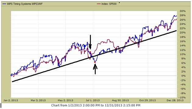
So, getting back to the point, the market in 2013 was in one big, continuous, strong up-trend for the entire year (see the 1st graph of the SPY benchmark below). This is about as smooth as a market can get. In 2013, the SPY was up about 26% and MIPS3 trading IWM was up 28%. Hard to complain about that !!!
Remember that it is hard if not impossible to "beat the index" in up-markets that do not present any opportunities to make money by being short. On the other hand, it is hard if not impossible not to make good money in these markets by just being long the entire time. The only way that you can lose money or not make money in these markets is by getting whipsawed.
You will notice that there are no real practical, intermediate-term down-trends in 2013, where MIPS could have made money by being short. Most of the "dips" in 2013 reversed themselves quickly before any new real trends formed, thus presenting a pattern where many fast-acting timing models got whipsawed. MIPS3 made only two trades in 2013, one on 6/24/13 (short) and a quick reversal on 7/3/13 (back to long).
MIPS3/MF in 2013 (2 trades - red dots) SPY +26% MIPS IWM +28%
Now the question should be: "How did MIPS3/MF do in other fast, high-growth markets in the past"?
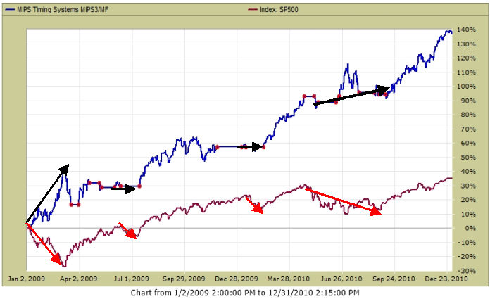
A good time period to examine to help answer that question is in 2009 and 2010. Remember, in strong up-markets, you can only really "best the index" by a healthy margin if and when your timing model identifies and trades real down-trends where "shorts" make money.
So, let's look at how MIPS3 trading IWM did along that line in 2009 and 2010 (two up-years).
- For that, see the graph immediately below. In the several times when the SPY went south, MIPS3 went
either "short" or to "cash".
As you can see from the graph below, if the market presents "tradable" down-trends where "shorts" make money, the MIPS models will most likely identify and trade them.
- MIPS3 below issued 10 trades in 2009 and 15 trades in 2010.
MIPS3/MF in 2009 and 2010 (25 trades - red dots) SPY +36 MIPS +138%

So, let's sit back and follow MIPS...
- remember, MIPS3 is a good model, but MIPS4 is even better
- if you can trade ETFs on the next day's open, use MIPS4
- but, if you must trade mutual funds on the next day's close, use MIPS3.
Wednesday, April 23 2014
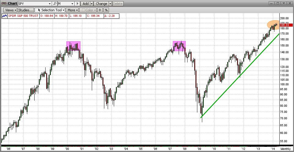
Are we in an up market now? It may look like one or feel like one, but that does not make it one. Besides, to answer that, we need a time frame. Over the last 5 years, we have definitely been in a strong up-market.
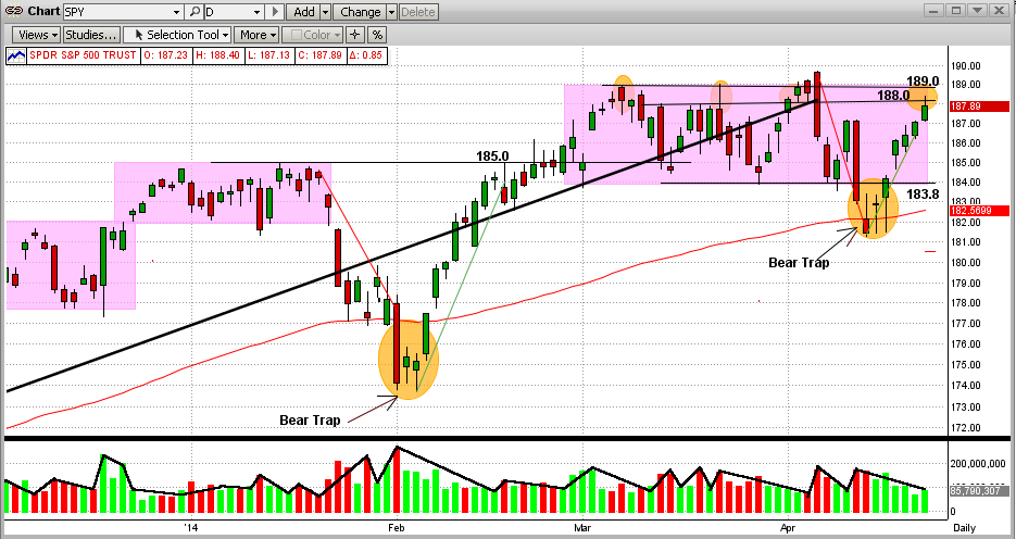
OK then, what about now? Well, the SPY has basically been relatively flat for most of 2014. Since the beginning of the year, the SPY is up about 4%, but almost all of that has happened in the last 6 days !!! See the graph below.
Short-term, we can see that the SPY has been in a "trading range" of 183.8-188.0 since the beginning of March 2014. We had a big drop near the beginning of April, when the SPY dropped from an intraday high of 189.6 to a low of 181.2 (-4.4%). That drop ended in a "bear-trap", when the SPY reversed itself the very next day and climbed all the way back to an intraday high of 188.4 today (and a close at 187.9). That's a gain of almost 4% in six days (impressive, but on low volume).
The worry comes from the fact that the SPY is very close to going back into "no-man's-land" (the "strip" between 188-189 on the SPY) for the 4th time in the last seven weeks !!! What happens next is anybody's guess. I will not feel comfortable on the upside unless the SPY breaks and holds above 189 for a few days/weeks (remember, where there are Bear Traps, there can also be Bull Traps).
By definition, what we can see is "on the surface". Even though our Market Strength Indicator sees a little deeper, it is not nearly as comprehensive as the MIPS models themselves ( http://www.mipstiming.com/msi___mips_members ). That is, the market could look weak on the outside (like in the most recent Bear Trap in the graph below), but the MIPS models were not "fooled" by what was happening only on the surface. While the surface looked weak, the guts were indeed stronger.
Sleep well, we have MIPS doing all of the heavy lifting
Monday, April 14 2014
We received a of lot questions in the last few days from MIPS members wanting to know what was MIPS assessment of the market (SP500 or SPY). Unless we would do an extensive, several day analysis of the internals of the MIPS models, we really can't honestly answer that question.
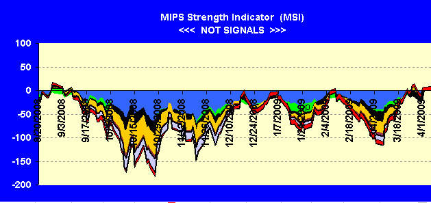
But, we have developed a "tool" that does just that, and it is available to MIPS members only. We call it the MIPS Market Strength Indicator (MSI) and it has been on our website for over one year. Recently, we improved the MSI, took it off of the front page, and made it available to MIPS members only. A "sample" MSI is still on our homepage for illustrative purposes, but it is delayed by 30 days or more.
You can access the up-to-date MSI by clicking on the link => http://www.mipstiming.com/msi___mips_members
- at the bottom of this email, we show you where to find this link on our homepage.
The MSI consists of several of our most accurate indicators. Hence, the MSI shows things like the relative strength of the market on a scale of -100 to +100. It aslo shows if the market is getting stronger (up-slope) or weaker (down-slope), etc. But it is NOT accurate enough to trade with.
The MSI can be compared to the "Vital Signs" charts that are available to physicians who "make the rounds" of their patients in a hospital. This Vital Signs Chart shows "indicators" of each patient's medical status, like their temperature, blood pressure, heart rate, etc. If any of these look bad, their physician will most likely dig deeper (like put them on medical alert, order more tests, etc.).
Today's up-to-date MSI looks like that immediately below. This chart tells me that the MSI sees the market as being very weak and one that could go anywhere from here.
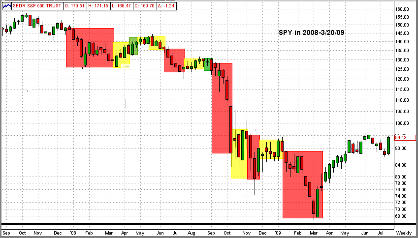
BEAR MARKET (from Sept'08 - Apr'09)
Does the little "dip" recently (in the graph above) constitute the beginning of a bear market ???
If you are surprised at the answer below, you most likely have never seen a bear market from the eyes of technical indicators. To help with that, we went back to 2008-09 and recreated the MSI. Surprised at the outcome ???
When you see this again (most likely sometime this year) MIPS should be short and we should be making money hand-over-fist.
Another little secret. When the bear comes, he comes fast, wreaks havoc, and NEVER lets up. Therefore, MIPS is almost never tempted to join a "fake" up-trend in a market crash, because there are NOT many to be found.
HOW TO ACCESS THE UP-TO-DATE MSI
MIPS Members can gain access to the current MSI graph by clicking on the "Up-To-Date" link in the MSI window on our homepage (see immediately below).
------> http://www.mipstiming.com/msi___mips_members
Sunday, April 06 2014
The stock market took a dive on Friday, but how bad was it? Actually, not so bad. On 4/03/2014, we sent out a blog with the title :"Hold Your Breath, We're In No-Man's Land". In this, we pointed out that the SPY had traded the range of $184-189 for the last 30+ days and had hit $189 three times, but had failed to break above that "all-time high" resistance level. You can see that in the graph immediately below. Well, it tried to do so again in the last two days, only to be "slapped" all the way back to $186.4 on the second try !!! That was about 1.7% from its high that day.
How bad was that? Well, we had comparable days like last Friday on Mar 26th, Mar 13th, and Feb 3rd, only to see the SPY come roaring back each time. So, how bad will last Friday really prove to be? And, how would you like it if this turns into a big "market crash"?
What "bad" should mean to you (or not mean to you) and what you should be (and should not be) worried about is discussed below. So, read on !!!
Another way to look at "How bad a day was last Friday" is to step back and look at Friday from a longer-term perspective. The graph below is the last two decades using monthly bars. From this we can see two things:
1) Looking at the last few bars (months), you can see that the market has been virtually unchanged.
2) In 2000 and 2007, it took the SPY 9-10 months each time to change direction from bull to bear markets.
Again, all of that watching and worrying for nothing !!!
PS - One of our most devoted MIPS members called Friday a collapse until she saw the graph below.
NOW FOR THE REAL POINT OF THIS BLOG.
MIPS members should NOT be worried about a market crash, they should be excited about one.
- The real reason that I am (and lots of our long-term MIPS members are) so relaxed is because of
the way that our MIPS3/MF model performed in 2008 (verified by TimerTrac.com)
1.) MIPS Signals
Green = Long Red = Short Yellow = Cash
2.) MIPS3 Performance in 2008 (4Q'07 - 2Q'09)
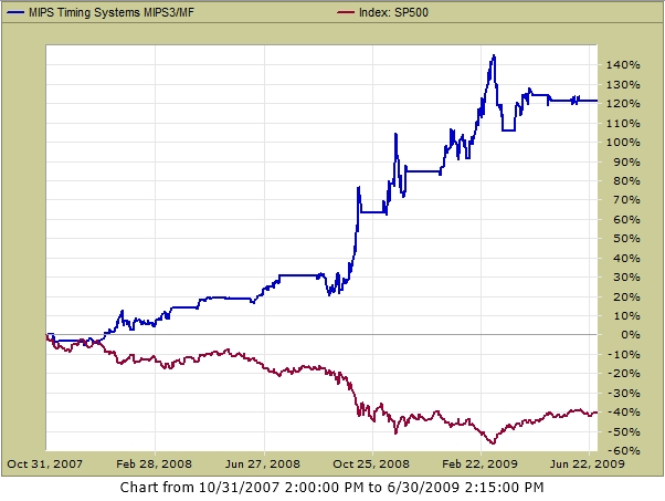
FEEL BETTER NOW ???
Thursday, April 03 2014
In our previous blog (immediately below), we showed that the SPY was having trouble breaking above its all-time high of $189/share.
Many times the stock market seems to follow the simple rule that after it tries something 3 times, it's time to move on and try something different (triple bottoms, head and shoulders tops, etc.). It seems like we are there again.
Better hold your breath as we seem to be in another "no-man's land". For the last 30+ days the highs/lows for the SPY were between about $184-189/share (plus/minus 1.3%). Looking closely at the graph immediately below, you can see that most of that time the SPY was actually between $184-188/share, breaking above $188 only three times. The first two times this happened, the SPY rose only to $189/share and was "slapped" all the way back to $184/share(actually to $183.8).
In the last couple of days, we see a "here we go again" movement. The SPY is back to $189/share again, and it did stick its nose slightly above that level for a short period of time today. If it gets slapped back again at this level, then $183.8 becomes the next support level (and then, it ain't pretty after that). On the other side, we are at the verge of the SPY breaking above its all-time high. Knowing that the S&P 500 closed above its all-time high today is very comforting.
But, when we remember that MIPS makes money in up and down markets, we really should not care which way the market moves from here. We have MIPS to tell us what to do, and when!!!
<<< Previous Blog >>>
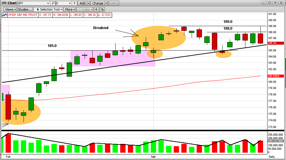
MIPS Members:
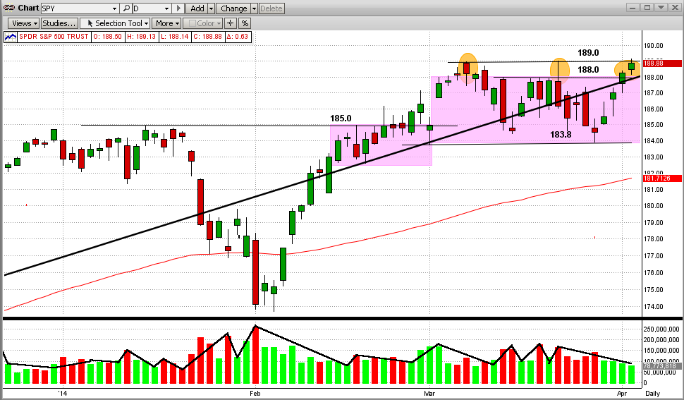
The SPY proved today that the market's "Stone Wall" that has prevented it from surpassing its all-time high is still there.
To see this plainly, please look at Graph #1 below:
1) The SPY hit its all-time high at $189 on 3/07/2014.
2) Then it trickled down for a few days followed by a big drop on 3/13/2014.
3) The SPY bounced back on the intersection of its trendline and support level at $185.
4) This uptick met an abrupt halt at $188, exactly where the big drop started several days before.
5) Since then, the SPY has tried and failed 3 more times to break above this "Stone Wall" at $188.
6) In fact, early today the SPY did pierce this level and climbed all the way to the all-time high level at $189,
only to be slapped all the way back down to the low of the day at $186.2 (see the 2nd Graph below).
7) The volume on down days was higher than on up days (bearish, but certainly not conclusive).
These movements in the SPY are more pronounced in Graph #2 below
Graph #1
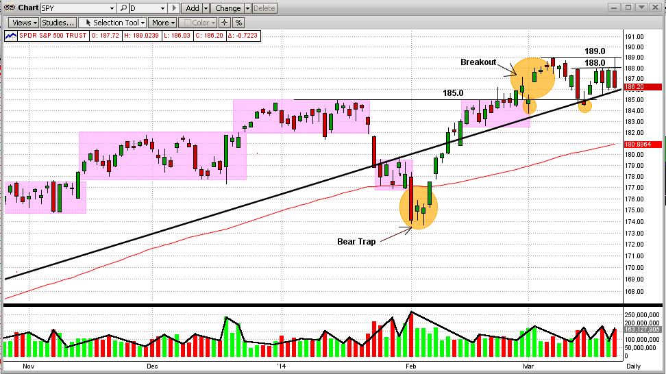
In Graph #2 below, the SPY now appears to be in an "Reverse Pennant" or "Widening Wedge" pattern, either or both of which could prove to be bearish. As we all know by now, there are plenty of reasons why this market should have had a correction by now and really only one big reason why it should continue to climb higher. However, the one big reason (the Fed) is starting to lose traction.
It's anybody's guess where the market will move from here. But MIPS does not guess, it calculates all the likely options and chooses the one with the highest probably. And, it almost always beats my guesses.
Graph #2
|


