Saturday, December 08 2012
Does history repeat itself? If so, does stock market behavior repeat itself? There are a lot of people that hope that it doesn't, but we know that many times it does.
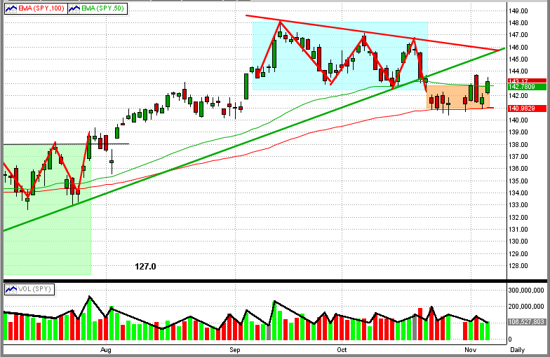
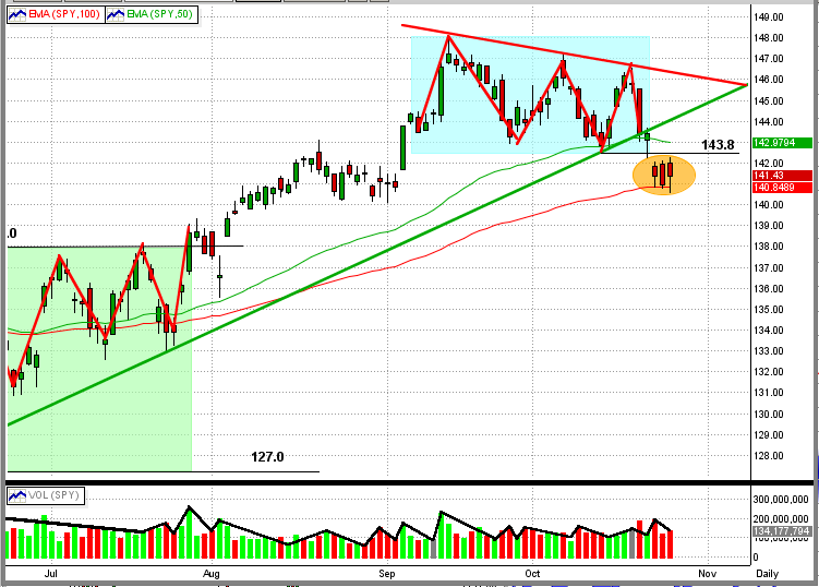
The two graphs below are pretty compelling.
The first graph is a picture of the stock market crash of 2008, and the second one is the market behavior in 2012.
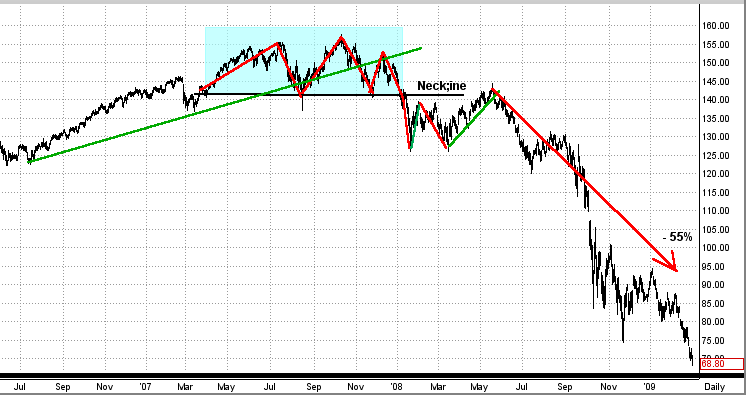
First Graph (2007-08)
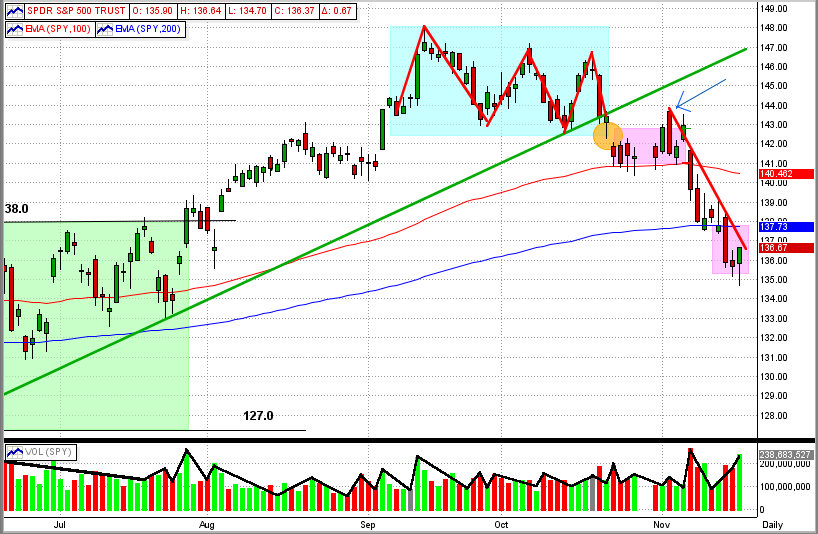
In 2007-08 the SPY formed a triple top in the second half of the year. During that time, the SPY broke its intermediate-term trend line and then it broke through the bottom of the neckline of the triple top. After a fall through the neckline, the SPY re-tested the resistance of the neckline, fell back some, and then re-tested the neckline again. After two attempts to break the neckline to the upside, the SPY fell apart and dropped 55% !!!
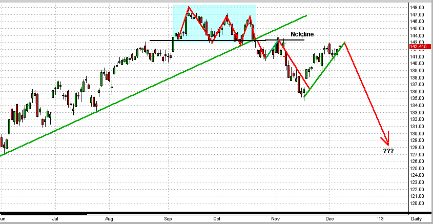
2nd Graph (2012)
In 2012 the SPY formed a triple top in the second half of the year. During that time, the SPY broke its intermediate-term trend line and then it broke through the bottom of the neckline of the triple top. After a fall through the neckline, the SPY re-tested the resistance of the neckline, fell back some, and then re-tested tested the neckline again. After two attempts to break the neckline to the upside, the SPY does what ??? (End of story for now.)
Pretty darn compelling and scary. Of course, the direction of the SPY (the market) most likely will show its hand in the next 2-3 months, and we will have either: (a) a booming bull market or (b) a big drop in the market. The good news it that, the bigger the move, the more we will make after MIPS determines the "new trend".
BTW- I follow MIPS, not the charts. But, over the years, I have found the charts to be a reasonable indicator (better than nothing). MIPS does not follow the the charts either; it is much more intricate than any one indicator.
Stock Market Crash of 2008 (graph is for the SPY)
Stock Market Crash of 2012 ???
Tuesday, December 04 2012
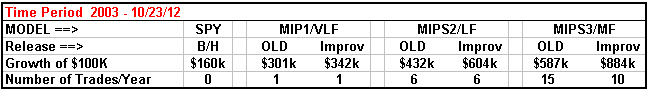
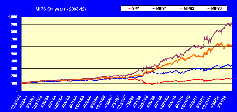
Good news, we are introducing new releases of our MIPS1/VLF, MIPS2/LF, and MIPS3/MF MIPS models that produce better results than our current models. The current models are very good, but the improved models ("Improv") are even better, with lower drawdowns and fewer trades/year. Please note that these are NOT new models, but simply revisions to the current models. Therefore, all models will retain their current names. BTW, "Improv" is an in-house project name for the development of these new models, and this name will not be used commercially. In this email, any reference to "Old" models means the current ones.
Of course, the past performance on our website and the past performance verified by TimerTrac.com will not change (can't change the past). But, our "release" process requires that we extensively "backtest" all new models (like the "Improv" models) to verify that they perform better than the current models over all time frames.
For example, see the table and graph immediately below
- the performance table and graph below were generated with "Improv" signals.
Performance with our "current" models can see seen on our website under the "Performance"
tab or under the "Signals" tab (past signals button); or performance results from our MIPS3/MF
model can be calculated and verified on TimerTrac.com from 11/04/05.
Monday, December 03 2012
As we all know, there is now somewhat equal pressure to push the market up as there is to push it down. The optimists are banking on our leaders solving our budget problems before we go over the fiscal cliff and on a Santa Claus rally that they have become accustomed to as in past Decembers. On the other hand, the pessimists are concentrating on a weakening EURO from defaults in some of the PIIGS countries, and are betting against the fiscal cliff problems being solved prior to Dec 31, 2012.
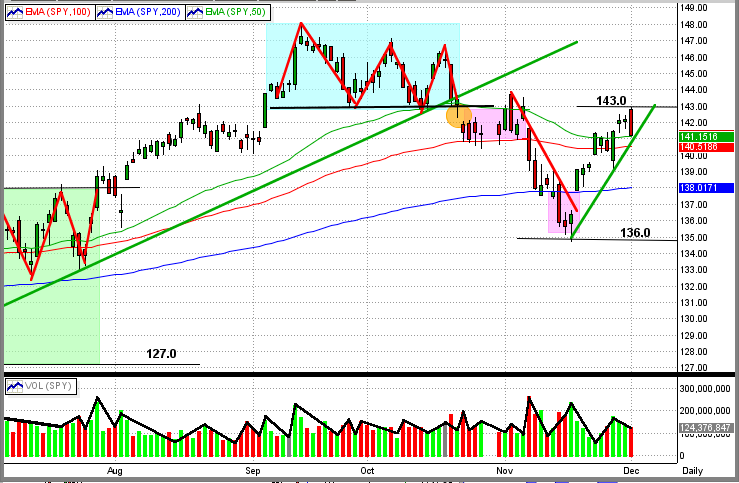
The graph below shows the recent market action (SPY price graph). From this, you can see the SPY breaking out of its November downdraft (red line) and forming a new, short-term up-trendline (rightmost green line).
Today (Dec 3rd), the SPY hit a strong upside resistance level at $143/share and bounced back down. That, of course, is bearish. This upside resistance is from the neckline of the recent triple-top (cyan box). The fact that the SPY hit and held above the 50-day EMA is bullish. The next support level is at $135/share on the SPY.
The greatest threat facing intermediate-term traders is if the SPY goes into a fast sideways trading pattern, like the one seemingly forming with tops at $143/share and bottoms at $135/share. This pattern would result in a sideways trading pattern with highs/lows plus and minus about 3% around the midpoint at $139/share. Unless an investor can trade close to these high/low points, they could get whipsawed and lose lots of $'s. Most investors cannot trade this pattern successfully on their own, and these investors need to follow a good timing system (like MIPS) or go to cash until the market breaks out of the sideways pattern, if it does form.
Or course, the SPY could simply turn around and break above $143/share into a rally or fall straight through $135/share into a new bear market. This is the type of market where MIPS can issue frequent trades because there is no solid intermediate-term trend, but that is better than being out of sync with the market and getting clobbered with fewer trades.
Friday, November 16 2012
We have received several emails from our subscribers asking how a model like MIPS3/MF, which trades an average of 15 times/year, can issue 2-3 trade signals in one week.,
The happens because:
1) the 15 trades/year for MIPS3/MF is an “average”, which means in some years it can trade
only 9 times (like in 2009) and in other years it may trade as many as 24 times (like in 2011), and
2) in any time frame, MIPS can trade 2-3 times in one month, and only one time in 3-5 months
(like at the end of 2010).
The main reason for this is the MIPS models have multiple “stop-gap” and “safe-guard” measures built in that “test” the integrity and accuracy of each and every signal. Specifically, for a few days after every trade, MIPS checks to see if the recent signal really is on the right track. These stop-gaps and safe-guards are NOT simply “stops” as we know them, but are proprietary algorithms that check to see if the SPY is following the expected price/volume pattern predicted by the algorithms in the recent signal.
Normally, the MIPS models issue new signals based on many indicators/algorithms that believe that they have found a directional change in the market, like an “Inflection Point” or a “Key Reversal”, etc. When MIPS issues a signal based on the consensus of these algorithms, it then spends the next few days verifying the “expected outcome”. If the “expected outcome” is not met, MIPS will either (a) reverse its position or (b) get out entirely (i.e., go to cash).
See the example below for Inflection Points
Click here for animated example =>
http://en.wikipedia.org/wiki/File:Graph_of_sliding_derivative_line.gif
In this graphic animated presentation from Wikipedia above, imagine that the curved blue line is the price of the SPY and the traveling lines are the “slope” of this price curve at any point on the curve. Therefore,
1) when the slope is pointed up, the SPY is in an upward pattern, and
2) when the slope is pointed down (red line), the SPY is in a downward pattern, and
3) when the slope is flat or zero (black line), the SPY is in a flat or sideways pattern, and
is signaling the potential of having reached an “Inflection Point”.
In the Wikipedia example above, at first the SPY is going up and the slope is pointing up (green up-line). When the slope turns flat/zero like it does near the Y-axis (black flat line), MIPS is looking for a change in direction in the SPY price from up to down (Inflection Point), and could signal a short signal. If the slope stays flat for a while or if the slope turns back up instead of turning down, MIPS could reverse its short signal and either (a) go long, or (b) go to cash. If MIPS does issue a cash signal and the slope then continues back up from there (as in the Wikipedia example as it crosses the Y-axis), MIPS will ultimately go long again. Over time, MIPS will go through tough periods trying to find a new trend and goes through 3-4 trades of –3% to +3%, but MIPS will ultimately find an intermediate trend (up or down) that will make us +10 to +15%, and the cycle repeats.
These “safety” algorithms above result in:
1) Negative - a few more trades than normal, and
2) Positive - greatly reduced losses on incorrect signals.
This can be seen in the MIPS long-term trading results below:
Winning/Losing Trades Average Gain/Loss
Winning Trades = 65% +3.0% Avg Gain/Trade
Losing Trades = 35% - 1.1% Avg Loss/Trade
After 100 trades, the win/loss ratio above equates to 195% up (65 x 3%) and 38.5% down (35 x 1.1), or 156% up (not compounded). Compounded, this would be in the range of 250% up (or more). And this happened in a market that was up only about 1% after 8 years and 100 MIPS trades.
We are not certain how many timing models have built in stop-gaps and safe-guards like MIPS, but we know a very large number of them that don’t.
Friday, November 16 2012
MIPS Members:
The SPY decisively broke its 200-day EMA on Wednesday, and the DIA and QQQ have been trading below their 200-day EMAs for the last 7-8 trading days. Thus far, of course, the market has not shown any signs of a rebound (see graph immediately below). All MIPS models have been short since late October, so let's keep our eyes and ears on government action regarding the "Fiscal Cliff". Remember, just a little good news can send an oversold market like this one straight up, if even for a short period of time and a "small" rally. And, don't forget about the Santa Claus rally the we wait for each year. With all of this to assimilate, we need to rely on new signals from the MIPS models for future guidance.
Monday, November 12 2012
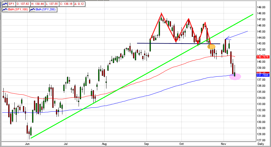
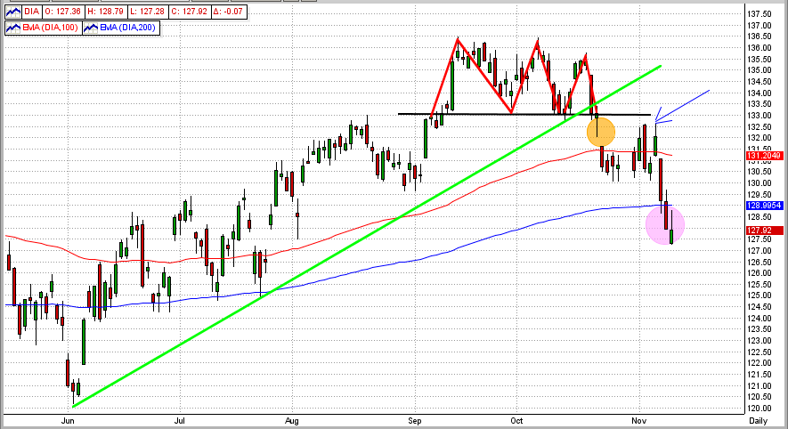
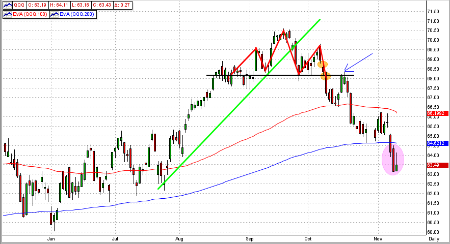
This market pullback is scary all right, but is it leading into a full-out bear market ?
- First, let's take a look at how markets normally behave heading into a bear market.
For a bear market to occur, it is usually preceded by most of the following:
1) a 3-6 year bull market,
2) bad news raises its ugly head (economic, political, etc.),
3) the market begins to react negatively to the bad news,
4) we see "topping" behavior in recent market moves,
5) a correction that breaks several important long-term resistance levels occurs,
6) an uptick that challenges some previous downside resistance levels occurs somewhere along the way,
7) a "free fall" begins, and
8) if the "free fall" is widespread (SPY, DIA, QQQ, small/large cap, across sectors, etc), it turns into a secular
bear market.
So, how has the market (as measured by the S&P 500 ETF, SPY) performed according to the above ?
(please refer to the graphs below)
1) we have had a bull market since March 2009 (S&P 500 up over 120%),
2) the economic/political news from all over the world (including the USA) couldn't be much worse,
3) the SPY is down almost 10% from its mid-September high,
4) the SPY (and the DIA and QQQ) have all formed either a triple top or a head-and-shoulders top (red triangles),
5) this last drop had broken the SPY's 6-month up trendline (green line) , its head-and-shoulder's
neckline (black line), its 100-day EMA (red line), and its 200-day EMA (blue line)
- the orange ellipse shows down "gaps"
6) after it broke the neckline, the SPY made a kick up to test that resistance level (blue arrow),
7) we are NOT technically in a "free fall" yet, but the future does not look good, and
8) the SPY barely broke its 200-day EMA and has only been there for one day, but the DIA and QQQ have
experienced very definitive 200-day EMA breaches (shown by the purple ellipses in the graphs).
Technical analysis would lead us to believe that we are on the verge of a serious downturn, but just the slightest good news (like our executive and legislative branches getting things done for our country instead of staying in gridlock for their own personal gains), could change that in a heartbeat. Thankfully, MIPS is much better equipped than us to make long/short decisions in this environment. Besides that, a mechanical mathematical system like MIPS is not too proud or too stubborn to admit a mistake and reverse its decision if it has made an incorrect call (as opposed to human behavior). So, as usual, let's wait for MIPS to tell us what to do next. BTW, all MIPS models are short now.
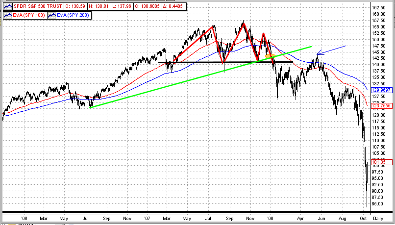
PS - Take a look at the 4th graph below (labeled 2007) to see how the market was unfolding in 2007.
See any similarities ?
SPY
 DIA
DIA
QQQ
2007
Tuesday, November 06 2012
There is a lot going on in the world these days, the most important of which is tonight's election. There are many possibilities that will follow who wins the election, but that is outside of the scope of the MIPS "commentary" emails.
However, there is one point that we would like to make regarding recent market action. For the last eight days, the market has traded in what we would call "No-Man's-Land" (see graph below). In the last 8-day period (orange box), the SPY has closed between its 50-day EMA on the upside (green line) and its 100-day EMA on the downside (red line). Last Friday, the SPY opened above its 50-day EMA, but fell back into this trading range by the close. Today, however, the SPY closed decisively above its 50-day EMA.
So, the question is: "Does this breakout of the recent trading range mean there is more upside coming or is it just another so-called "bull trap", which sucks the bulls back into long positions only to turn right back to the downside. Of course, no one really knows the answer to this (not enough info), and we will just have to wait and see.
Or, does MIPS see this breakout as a new "Inflection Point" (from down-to-up) ? The answer is "not yet", so again we will just have to wait for MIPS to tell us what to do next, and when.
Friday, October 26 2012
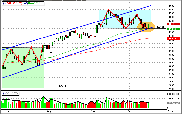
The market has fallen to another critical level.
After falling about 4% in four trading days, the SPY has spent the last three days traveling along the "100-day EMA road" for the last three days (see Graph #1 immediately below). This is a critical point in the market because:
1) to get there, the SPY had to break resistance at $143.8 and 142.0 (i.e., the revered 1420 in the S&P 500).
2) the SPY is right on the very top of its 100-day EMA (red line),
3) we have seen bad 3rd quarter profit/outlook from some of the most stable companies in the counrty,
4) with bad profit and outlook numbers from tech leaders (Amazon, Apple, etc) after hours on Thursday, the
futures are down so we can expect a lower opening on Friday,
5) with any more bad economic/earnings data in the US, or bad news from Europe or China, this downdraft
could pick up steam quickly, and
6) these are very turbulent times and conditions/sentiment can change quickly.
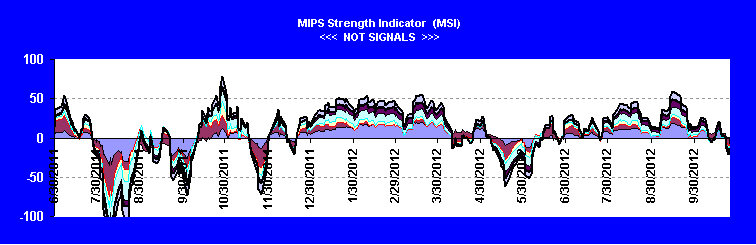
All of the MIPS models (except the very low frequency MIPS1/VLF model) are short at this time. To get a better feeling of how MIPS "sees" the strength (or weakness) of this market, take a look at Graph #2 below.
Graph #1
Graph #2
This graph shows the MIPS Strength Indicator (MSI) for the SPY. The MSI is a measure of the "strengh" of the market
trend as determined by the leading indicators in our MIPS models. You can see this graph about 1/3 down on the homepage of our website. The MSI graph is updated on our website at least once a week. CAUTION: The MSI is a measure of the strength of the market, but is NOT to be seen as or used as a "signal" indicator !!!
Monday, October 15 2012
It looks like we dodged a bullet today. From our last look at the SPY price/volume chart in our previous email, it looked as though we could be about to experience a serious downdraft. But, MIPS kept us LONG, and we are glad it did.
Today, the SPY hit a very critical downside price point and bounced back to the upside (see graph below).
At a price of $143 per share (black line), the SPY encountered the following resistance levels:
1) the 50-day EMA (green line),
2) the intermediate term trendline (blue line), and
3) the bottom of its six weeks trading range (cyan box).
Needless to say, it did not breach any of these resistance levels (which should prove to be very positive).
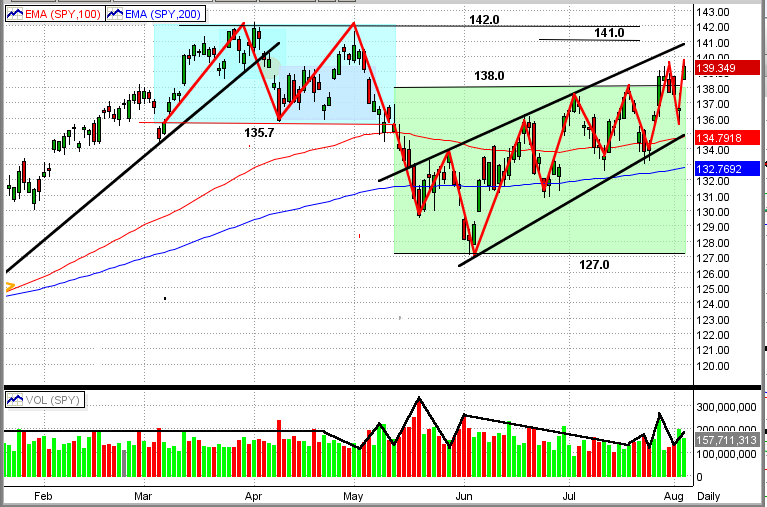
Saturday, August 04 2012
As suggested in our previous post, the market appears to be in a slow growing up-trend.
See the new graph immediately below. From this, you can see that:
1) The SPY has broken out of its prior trading range (green rectangle) to the up-side
2) The up-channel is readily apparent (black lines)
3) Since mid-year, the market is moving with precision to higher-highs and higher-lows
4) The SPY is above both of its 100-day and 200-day EMAs
5) In the last two swings, the SPY volume has been increasing in up markets and dropping in down markets
Let's enjoy this up-trend while it lasts. We expect a high level of upside resistance for the SPY between $141-142/share.
- if the SPY breaks this resistance to the upside, its next big resistance levels are between about $145-150/share
- at this time, we are about 13% below the 2000 and 2007 highs (approx. $157/share)
- this would be a good goal to attain, but it would also make an ideal point for the big guys to start selling big time.
If, or when, the market turns down (as it probably should), MIPS will get us to a cash or short position in ample time.
|


