Tuesday, September 23 2014
We are pleased to report that we had a large number of respondents to our recent "Survey" email (see Survey email below). Most were very passionate and confident about their vote. And, many of our MIPS members are seasoned investors and/or professional money managers.
Rounding off to the nearest 5%, the final vote was:
UP DOWN Don't Know
65% 30% 5%
Thanks for your inputs...
- and remember, no matter what we think, we do not personally have to be right to make money in the market
- we just need to follow MIPS !!!
Feel free to contact me with questions (10am-8pm CDT, 6 days/week)
Paul Distefano
===============================================================================


     <<< "Survey" email from 9/19/2014 >>>
          MIPS - Survey: S&P500 3000 or 1000 ???
MIPS Members:
Of course, it is possible that this market will continue up at least until the S&P 500 reaches 3000. On the other hand, it is just as likely that the S&P 500 will collapse all the way down to 1000 or lower.
This market is similar to the market in 1995, where the Nasdaq had risen 10-fold in the prior years from 1985. In 1995, everyone was crying bubble, bubble, bubble and the Fed Chairman Greenspan coined the phrase "Irrational Exuberance" (meaning 100% emotional behavior). So, where did the market go from there? It continue up 6-fold from 750 to over 4500 in the next five years !!! [See our previous email below from May 11, 2013 entitled " History Repeats Itself, Like 1995 or 2000?"].
As one would expect, after the Nasdaq reached 5000 in the year 2000, the Nasdaq crashed big-time (65% drop) !!!
VOTE Up or Down in your email response
So, we would like your opinion as to whether we are:
1) in a market like 1995 where the market is going to continue up at least another 50% (to
a S&P 500 of at least 3000) or
2) in a market like 2000 where the market is going to crash at least 50% (to S&P 1000) ???
Thanks
Paul Distefano
=================================================================================
Saturday, 11 May 2013
As with almost everything in this world, the behavior of the stock market is made up of actions from millions of people. And, as with almost everything in this world, the stock market does kind of repeat itself. The $64,000 question is what is repeating and when?
This week I saw a talking head on CNBC discussing what was going on in the market and why, and if the current 5-year bull market would continue. Like most others, he gave a very nondescript answer. His short answer (and my interpretation of his answer) was that the action of the stock market would follow one of the options below:
1) Rational Exuberance - 60% (that is, keep going up as it should)
2) Irrational Exuberance - 30% (that is, going up faster, even though it should not)
3) Market Crash - 10% (that is, a complete reversal from today's bull market action).
This reminds me of three market behaviors of the Nasdaq in the 1990's (when Alan Greenspan coined the term "Irrational Exuberance").
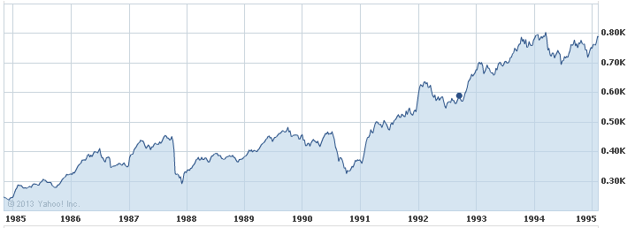
Graph 1 - Rational Exuberance
This graph shows the Nasdaq from 1985-1995, when the index TRIPLED, but did so because technology was booming. This fits "Rational Exuberance" because everyone was happily making money on the high growth of companies like Microsoft, Oracle, Cisco, etc. In this 10-year period, the Nasdaq rose in value from about 250 to 775, ending with "overbought" conditions, nose-bleed P/E ratios (Cisco had a P/E ratio of over 100), etc. Then, the pundits were were crying, GET OUT!!!
Were they right?
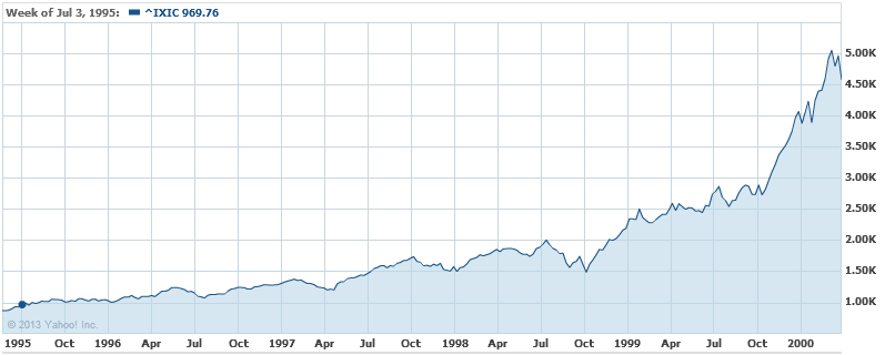
Graph 2 - Irrational Exuberance
Of course, the pundits were right about the fundamentals, but DEAD WRONG about the Nasdaq market performance
- the proof lies in the following 5 years performance [that is, in the time period of 1995-2999 (Graph 2)]
- this is when everyone (especially the little guys) went into panic buying ("Irrational Exuberance")
- the net result over this 5-year period was that the Nasdaq WENT UP OVER SIX-FOLD, from 775 to 5000, with
crazy things like Cisco's P/E ratio growing to over 400, Yahoo's market cap being more than the GDP of Iceland, etc.
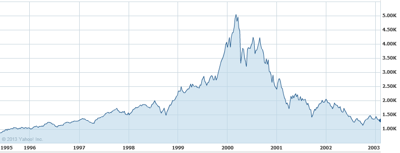
Graph 3 - Market Crash
We all know that US stock market indices went up in smoke after the year 2000, but getting out in 1995 was way too early.
OUR POINT IS THAT SINCE THE MARKET DID RECENTLY BREAK TO THE UPSIDE AND SET NEW ALL-TIME HIGHS, AND IF THE BIG GUYS GET THEIR WAY, THE LITTLE GUYS CAN PUSH THIS MARKET WAY HIGHER THAN IT SHOULD GO (like 1995-2000), AND THEN THE BIG GUYS WILL DUMP BIG-TIME (like 2000).
BUT, IF THE LITTLE GUYS ARE NOT ABLE TO KEEP THE SPY ABOVE ITS CURRENT RESISTANCE LEVELS, THE BIG GUYS WILL MOST LIKELY SELL DOWN. OF COURSE, THIS CAN RESULT IN (1) A RELATIVELY SMALL DIP WITH A CONTINUED UPTREND, OR (2) A BIG MARKET CRASH (like 2000).
We certainly can't predict what will happen from here, and that is why we developed and follow the MIPS models. If and when this market makes a major change, MIPS will most likely miss a minor part of the change, but will find and follow the resulting trend. And, MIPS should ignore minor changes to prevent getting whipsawed.
Thursday, September 18 2014
Lots of action this week. Of course, Yellen is still doing everything she can to help the fat kats to get fatter. She claims that her efforts to drive interest rates to near zero are to boost the economy and to help the little guys, but we all know better than to buy that. If the Fed really wanted to help the little guys, it could have simply given each family in our country over $55,000 each (not practical, but we did print that much new money).
So, where did the money go? Of course, quantitative easing has helped the economy and the little guys some, but the real benefactors have been the top 1% who have funneled money to themselves en masse by borrowing hundreds of billions of $'s at near zero interest and "raking it in" with things like huge gains in higher-and-higher stock prices. For example, the process has been to:
(a) borrow at near zero interest,
(b) buy back company stock,
(c) profits/share go up because the number of shares go down, NOT because profits go up,
(d) stock prices go up both from the higher buying volume and the "higher" profits/share ratio,
(e) fat kats make big money on the higher stock prices of their personal shares, and
(f) fat kats get huge bonuses because "they" increased the profits/share.
And, there is still tons of money out there that has not yet found its way into the economy.
If will be very difficult for the stock market to collapse while this process continues and when there is really no other competitive place to invest big money with high liquidity.
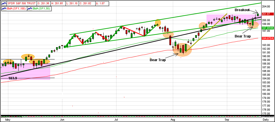
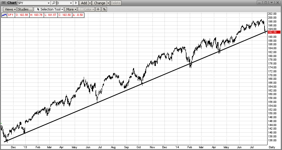
See the graph immediately below:
What you see is the tail-end of a 19-month uptrend (black line), a breakout today to the upside from within a 3-week sideways trading pattern (pink rectangle), and a new high on the SPY at $201.70/share. Upside resistance is at the upper end of the green trading range, and downside support is at the 50-day EMA.
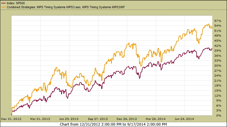
During this 19-month trend period, the number of MIPS3 trades has been very low due to the strong market uptrend (MIPS does not trade just to trade). The MIPS3/MF model usually trades 10-15 times/year, but it has only traded about 6 times since the end of 2012. More trades in a market like this usually result in getting whipsawed (as many other timing models have experienced).
So, how did MIPS3/MF perform during this time frame ???
See the graph of MIPS3 below trading 1/2 each of SPY and SSO on Long signals (1.5x leverage) and 100% SH on Short signals (no leverage). During this time, MIPS3 was up +54% !!!
Wednesday, September 10 2014
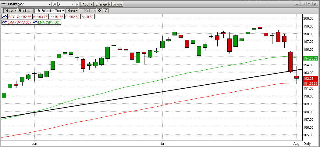
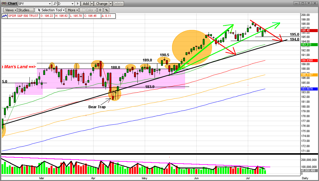
This blog is an update to our previous 8/19/2014 email (shown below this current email). That was when the newest short-term trend, which started in late-May 2014, went into a big dip on 7/25/2014, and then started a recovery from this Bear Trap on 8/18/14, had just worked its way back into the green-line up-channel.
Since then, the SPY continued the up-trend for a few days (gold trendline) and then went into a 14-day sideways trading pattern (pink box). Today, the SPY "tested" the sideways pattern bottom (pink), the intermediate-term trendline (black), and the bottom up-channel trendline (green), and "held-the-line" on all three (see graph immediately below).
Legend:
Green Curved Line = 50-Day EMA
Red Curved Line = 100-Day EMA
Black Line = Intermediate-Term Trend Line
Green Lines - Short-Term Trend Lines
Purple Box = Sideways/Flat Trading Pattern
Orange Circles = Significant Points
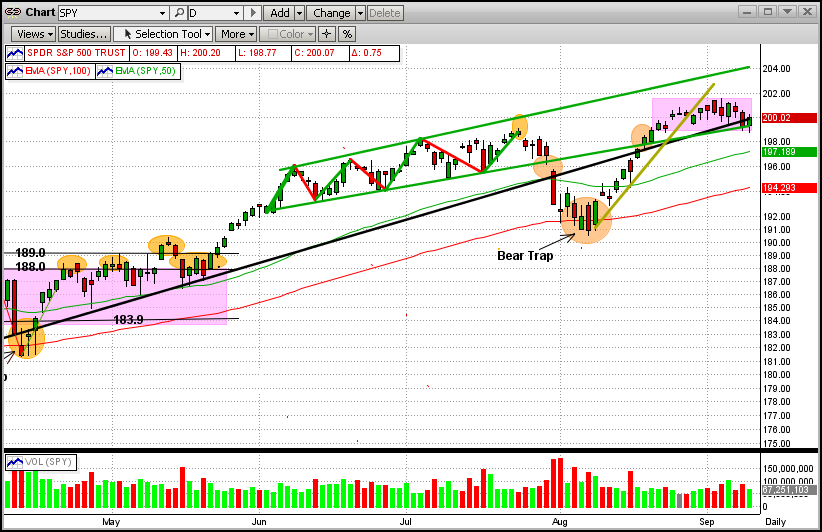
It is interesting that the majority of the times that a market goes into a sideways pattern, it breaks out the way that it went in (like now, the SPY entered the sideways trading pattern going up, so we expect it to break out to the upside). After that, the next upside goal is to break the upper trendline in the green up-channel trading range. On the downside, the SPY has support at both the 50-day EMA and the 100-day EMA (the latter of which lies about 3% below today's close).
The odds are for the uptrend to continue (the MIPS models all remain long at this time). We all know that this can change at any time and believe that MIPS will get us out when it does. So, sleep well.
Tuesday, August 19 2014
8-19-2014
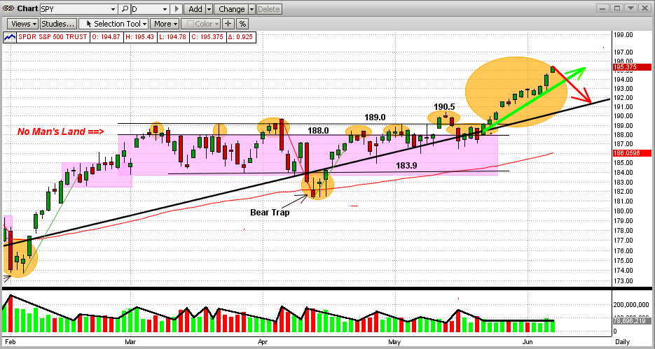
This blog is all about the latest short-term trend in the market, which started on 5/22/2014 with a breakout of the SPY after a 2-1/2 month sideways/flat market (remember "No Man's Land" in the purple box below). Of course, this is the tail end (so far) of a strong intermediate-term uptrend that started almost 2 years ago in Nov 2012 (black line). See the graph below.
Legend:
Green Curved Line = 50-Day EMA
Red Curved Line = 100-Day EMA
Black Line = Intermediate-Term Trend Line
Green Lines - Short-Term Trend Lines
Purple Box = Sideways/Flat Trading Pattern
Orange Circles = Significant Points
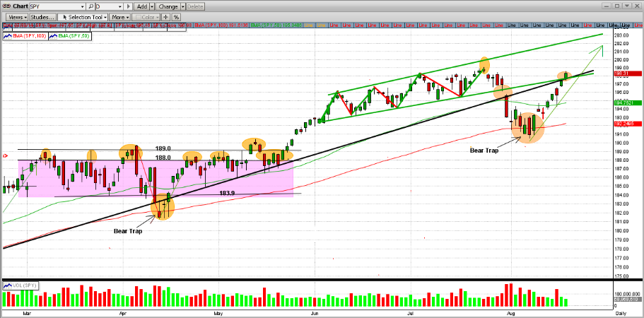
We are most interested in the pattern that started developing at the beginning of June 2014. This has evolved into what is called an "up channel". Swing trades will trade this as follows: Buy when the SPY hits the bottom channel line and Sell when it hits the upper channel line. Some very experienced swing traders can make money at this, but most amateurs get crushed (surprise, surprise). Most of the time, trading these patterns leads to getting whipsawed badly. For most investors, it is best to ride the uptrend by staying long (or short in downtrends).
The market (the SPY) traded in this range almost to perfection until the 3rd week in July when it failed to "hit" the upper trendline, and then it fell 4.3% over the next 2 weeks (from about 199-190). Also, during that fall, the SPY broke both its 50-Day EMA and 100-Day EMA. Of course, this caused many traders to go short, only to get whipsawed with a quick reversal a couple of days later. MIPS dodged this "Bear Trap" and stayed long. At the close today, MIPS was under its all-time high price by only 1/3 of 1% !!!.
For the uptrend to be re-established, the SPY will need to climb above its all-time high of $199.1 (on 7/21/2014). If it does we, along with 200 million other investors in the US stock markets from all over the world, will make more money on this uptrend (even better if you have a percent of your money in double leverage, like the SSO). Better yet, if the market does tank, we (along with a relatively few individual investors that "short" like the hedge fund managers do) will make lots of money. So, don't be afraid of the "Big One". Hope for and embrace it !!!
Sleep Well !!!
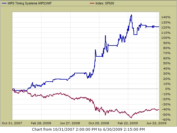
Remember what MIPS did in 2008?
- If not, see below
Red=Shorts, Green=Longs, Yellow=Cash
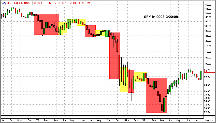
MIPS in 2008 (from TImerTrac.com)
- look forward to repeating something similar to that below
Sunday, August 03 2014
August 3, 2014
At the end of last week, we had a large number of members asking "Is this the beginning-of-the-end of our 5+ year bull market"? Of course, this was prompted by last week's terrible market performance.
Before we go too deep, let's take a look at some recent market action of the SPY (ETF for the S&P 500). (Remember, the SPY's price is about 1/10th of that of the S&P 500.)
Look at the 1st Graph below (SPY).
In this recent time period, the last 6 trading days were bad. But how bad is bad and where does it take us?
- The SPY dropped almost 4.5% in the last 6 trading days in the graph below.
- On the last day in the graph below, the SPY broke down through the 100-day EMA and the long-term trendline.
- On the day before that, the SPY had one of its worst one-day drops in over a year (-2% in one day).
1) Does the price action of the SPY (steep drops) upset you?
2) Are you having trouble sleeping because of it?
3) Do you think that this the beginning of a real Bear Market?
4) How far do you think the SPY will drop from here?
5) Are you ready to "override" the MIPS long signal and go to cash or short?
1st Graph
Usually when we look at price action graphs, I try to explain what I think happened and what might happen from here on. Well, this time I know 100% what happens next. Yes 100%, and guaranteed. And no, I have not lost my mind nor do I think that I have somehow acquired divine status.
This reason that I can make this iron-clad guarantee is that the graph above (that looks so much last week's price action) is actually from 4/11/14 (3-1/2 months ago). From that exact day, the SPY reversed itself and continued up (+8.5%) until 7/30/14. See Graph #2 below.
Graph #2
Now how do you feel about the price action in Graph #1 from 4/11/14? Now that you have seen a nice recovery and more up-side gains, your fear and confusion most likely just sank into a sinkhole. So, are we through with those kinds of scares. Heck no, and the market is no place for the weak of heart or mind (unless, of course, you have MIPS covering your back).
Let's truly visit what we thought we were looking at in the very beginning of this blog - the price action of the SPY last week (see Graph #3 below). Do you see the resemblance of this graph that goes through 8/01/14 to that in Graph #1 that goes through 4/11/14? The markets do repeat themselves.
Graph #3
Now we can go back to our old way of playing the game. Where do we go from here? We believe that there is just as good a chance of the market turning around and heading back up (as it did 8-10 times in the last 20 months - Graph #4 below) as of it heading down into a large correction or a real bear market. Each of these scenarios have credibility and each is possible.
But, that is just what we think. MIPS is looking at this from a completely different angle. I can say that some of the MIPS models are on the brink of going short, but one or two up-days can change that. Let's keep a close eye on changes in the MSI and watch for MIPS signals.
Graph #4
Hope this helps !!!
Monday, July 14 2014
As most MIPS members already know, we show several possible trading profiles for our MIPS models under the "Services" tab on our main menu at www.mipstiming.com.
CONSERVATIVE TRADING
Trading the SPY long only is the most conservative trading profile for our MIPS models, and trading SPY/SH is the most conservative for long/short trading.
AGGRESSIVE TRADING
Shown below are several trading profiles that are more aggressive than simply trading SPY/SH long/short. Of course, these trading profiles are for more aggressive investors. And, since we are NOT overly aggressive , we recommend trading a "mix" of ETFs, like 1/3 each of SPY, IWM, SSO on long signals and the inverse ETFs, SH, RWM, SH* on short signals (* where SH is the single leverage inverse fund for SPY because we do not like trading double leverage on shorts). This is the trading profile #4 below (CAGR=40.3%, Max DD=-12.1%).
See Perfromnace Results for the various trading profiles below:
Note: The scale on the Y-axis is different in each graph below.
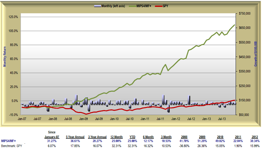
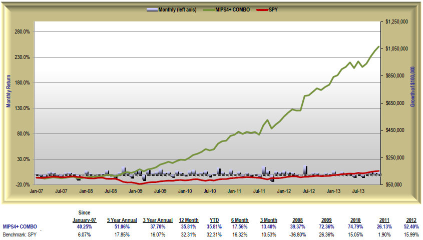
1.) MIPS4/MF+ Trading SPY/SH from 2007-2013
CAGR since Jan'07 SPY=+6.1% vs. MIPS=+31.3% Max Drawdown= -10.6%
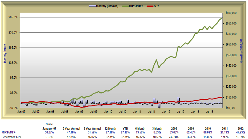
2.) MIPS4/MF+ Trading IWM/RWM from 2007-2013
CAGR since Jan'07 SPY=+6.1% vs. MIPS=+36.9% Max Drawdown= -15.1%
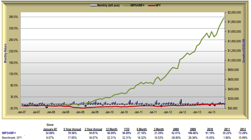
3.) MIPS4/MF+ Trading SSO/SH from 2007-2013
CAGR since Jan'07 SPY=+6.1% vs. MIPS=+52.7% Max Drawdown= -16.1%
4.) MIPS4/MF+ Trading 1/3 each of SPY/SH, IWM/RWM, SSO/SH from 2007-2013
CAGR since Jan'07 SPY=+6.1% vs. MIPS=+40.3% Max Drawdown= -12.1%
Sunday, July 13 2014
In our previous Blog from 6/07/2014 below, we showed the "breakout" of the SPY after months of sideways trading. The market (the SPY) broke decisively to the upside. In the graph in that Blog, we pointed out that the new uptrend could continue for a while (green arrow), or go back down (red arrow) to "test" the long-term trendline (black line). Of course, we did not expect a downside "breach" at that time.
So, what has happened since then. As can be seen in the new graph immediately below, the SPY has made a few minor dips, but it is still fighting its way up. And, it has only experienced 3 tiny downdrafts since the breakout. One problem with the uptrend since last February is that it has "climbed the wall" on ever decreasing (but not really low) volume. We can live with that for now. The new support level for the SPY is at $194, the point at which both the long-term trendline (black line) and the 50-day EMA (green line) converge. So, if the SPY should break below $194, we will have grave concerns about a major dip (if not the "biggie" itself). Keep your eyes open because this is where the 3rd "dip" (2nd red arrow) could be heading.
Let's stay alert and wait for MIPS to tell us what to do next.
<<< Previous Blog >>>
Saturday, 07 June 2014
After six failed attempts in a three-month sideways trading pattern, the market (the SPY) finally broke out to the upside from inside a "No Man's Land". And, what a breakout it has been! In the graph below, you can now see a new, powerful up-trend (green line).
It seems that this breakout has, so far, followed the tradition for sideways/flat patterns, that is:
1) markets usually breakout of a sideways pattern in the same way that they entered (i.e., if the market was moving up prior to the sideways pattern, it will usually break out to the upside and vice versa), and
2) the length of time that the market will follow the resulting move and the size of the resulting gains/losses is closely correlated to the amount of time that the market traded in the tight pattern.
My opinion on the reason for #2 above is that after a long battle, the losers (in this case, the bears) quit trading and go away for a long time. I also believe that this is how the market (like now) can make sizeable, sustainable gains on relatively low volume (little or no competition).
It seems that the most likely direction of the market from here is up. But, even though it could, this does NOT mean that the market will follow the green-line trendline in the graph below going forward. It's just as likely that the SPY could drop back some or go sideways until it hits the long-term trendline (black line in graph below), and then follow that trend up going forward. That would be like a "reversion to the trendline". Either way, we make money.
Also, do not rule out a correction after these healthy gains. It is not what I expect, but MIPS does not pay one bit of attention to my expectations. If the market does somehow unexpectedly drop from here, MIPS will get us out.
===================================================================================
Tuesday, July 01 2014
Many investors think that the bull market that resulted from the massive market crash of 2008 is over, or very near its end. That is highly possible, of course, but NOT a certainty. Many individual investors are basing their opinions on the bull market "recovery" between the two market crashes in 2000 and 2008.
See the 1st graph below:
The bull market between the bottom of the 2000 crash (in 2003) and the top of the resulting bull market in 2007 lasted 5 years. And, the bull market since 2008 is already older than 5 years.
Also, in the 20-year-period between 1960-1980, the stock market experienced 5 crashes of 35% or more
(4 year averages). => http://www.mipstiming.com/behavior
So, is it not time for another market crash?
SPY Between 1998-2014
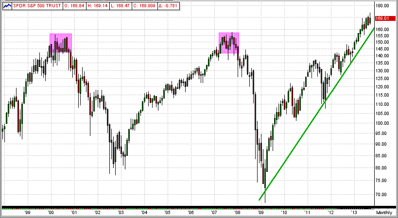
Maybe so, and maybe not. If you follow the market "logic" in the 2000's, a market crash is definitely due. But, let's look back at the most recent crash before 2000. This would be the notorious crash of 1987.
See the first 5 years after the crash of 1987 in the graph below. Using the "2000" logic above, this market recovery would have run out of steam at or near the end of 1992. But, did it ?
SPY Between 1987-1993
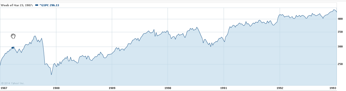
As can be seen below, this 1988 bull did not quit running until the end of 1999 or beginning of 2000
(12 years after the crash of 1987) !!!
SPY Between 1987-2000
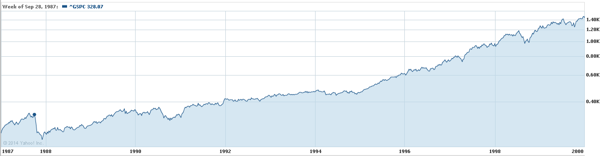
So, history shows that bull markets (like our current 2009 bull market) do NOT necessarily have to stop running up because they are "old" after just 5 years.
The moral of this story is that:
1) it is very difficult to arbitrarily call the end of either a bull or bear run,
2) the MIPS models are very good at finding "Market Inflection Points" (when markets change direction), and
3) since the MIPS models work as well (or actually better) in down markets as they do in up markets, we need to quit worrying about "market crashes" (and, in fact, welcome them).
Our belief is that this 5-year bull run will continue for some time (but probably not 7 more years). And, we will see "corrections" on the way up. Of course, this is only my personal opinion, and we will follow (as you should) the much "smarter" MIPS models.
Saturday, June 07 2014
After six failed attempts in a three-month sideways trading pattern, the market (the SPY) finally broke out to the upside from inside a "No Man's Land". And, what a breakout it has been! In the graph below, you can now see a new, powerful up-trend (green line).
It seems that this breakout has, so far, followed the tradition for sideways/flat patterns, that is:
1) markets usually breakout of a sideways pattern in the same way that they entered (i.e., if the market was moving up prior to the sideways pattern, it will usually break out to the upside and vice versa), and
2) the length of time that the market will follow the resulting move and the size of the resulting gains/losses is closely correlated to the amount of time that the market traded in the tight pattern.
My opinion on the reason for #2 above is that after a long battle, the losers (in this case, the bears) quit trading and go away for a long time. I also believe that this is how the market (like now) can make sizeable, sustainable gains on relatively low volume (little or no competition).
It seems that the most likely direction of the market from here is up. But, even though it could, this does NOT mean that the market will follow the green-line trendline in the graph below going forward. It's just as likely that the SPY could drop back some or go sideways until it hits the long-term trendline (black line in graph below), and then follow that trend up going forward. That would be like a "reversion to the trendline". Either way, we make money.
Also, do not rule out a correction after these healthy gains. It is not what I expect, but MIPS does not pay one bit of attention to my expectations. If the market does somehow unexpectedly drop from here, MIPS will get us out.
===================================================================================
<<< Previous Blog >>>
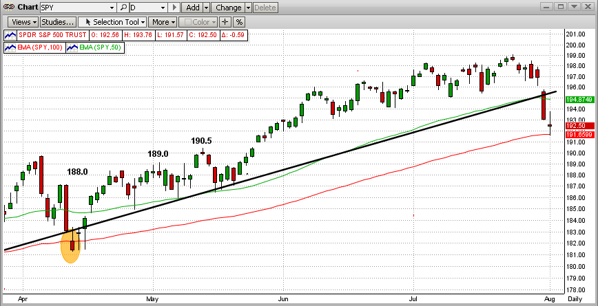
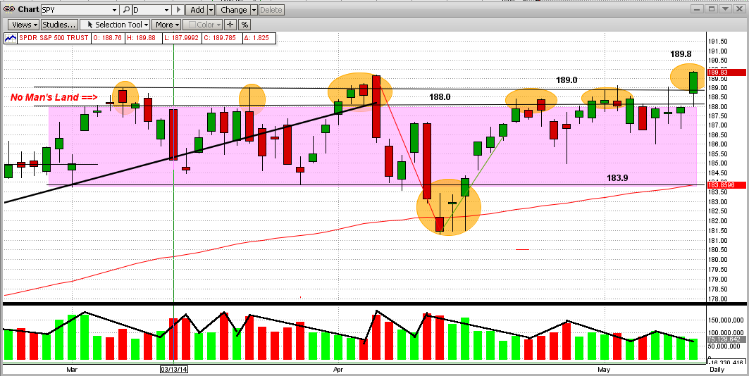
For some time, we have been talking about this war between the Bulls and Bears, but we never really defined it. We call it a war, because that is what it is like.
To help explain this, let's refer to the "Battleground" map below, with the following "definitions".
1) The SPY numbers ($188/share) are kind of like "mile markers".
2) The main battlefield is the purple area between markers 184 and 188.
3) The first wall of resistance in the battle is at 188 and the absolute "stone wall resistance" is at 189.
4) Between 188-189 lies an area that we call No Man's Land, that is deadly to try to cross or occupy.
It is like the Normandy Beach in WWII, the Shenandoah River in the Civil War, or a "moat" in the
Middle Ages. The casualties in this "zone" are almost unbearable, but sometimes attackers manage
to cross it. (Like now?)
So, using the above definitions, the History of the Battle of No Man's Land is:
1) Let's say the green bars are attacks by the Bulls and the red bars are retreats.
2) The Bulls attacked the Bear's first resistance level at 188 in the first week of March 2014 and then
pushed through No Man's land to 189 before getting stopped, routed on 3/13/14 and pushed back
to about 183.5 by mid-March.
3) Then there were 5 more broad attacks during the battle (orange ellipses).
4) The Bulls camped at the 188 level or hunkered down in No Man's Land for 26 days/nights in this
2-1/2 month battle.
5) The Bulls hit or broke over the wall at 189 nine times in this battle and failed every time, except on
its ninth try (today), where it stopped at 189.8.
6) One major problem is that the breach today above 189 came on low volume (kind of like the Bear's
super troops were not in this battle).
7) Now it is up to the Bulls to "hold their ground" and/or capture more territory, while the Bears must
concentrate on re-claiming the territory that it lost today.
The Bulls should not celebrate until the market moves higher or at least they retain what they have gained so far.
Our MIPS Market Strength Indicator is strong to the upside now, but we all know that this can change quickly.
- see 2nd graph below.
Remember, MIPS may see this somewhat differently, so let's wait for MIPS' signals.
Battleground Map
Sunday, May 25 2014
During most of 2013 and 2014, we have received emails from MIPS members wanting to know why the MIPS models stayed Long for so long without often going short. This was due to the fact that our MIPS3/MF model, for example, traded only 2 times in 2013 and 2 times in 2014, the lowest in the MIPS3/MF eight-year-plus history.
When asked why they thought that MIPS should have traded more often, they mainly said the "volatility in the market" (as in the SPY). On the surface, I can certainly see why they would feel that way. See the graph below. From this, it looks like there were several good opportunities to short, but the risk of getting whipsawed in a market like this is very high. In fact, many timing models did get sucked in to short positions several times, only to get whipsawed almost every time.
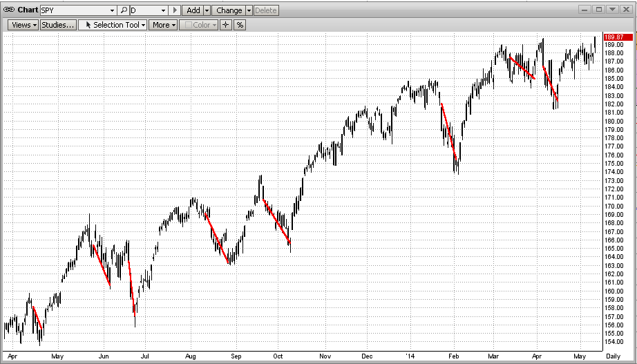
It is very difficult to ascertain from the "surface" of a price action graph where the market will go next or what the underlying strength of the market is at any point in time. This is one reason why MIPS provides its proprietary Market Strength Indicator (MSI) graph on its website for MIPS members at:
=> http://www.mipstiming.com/msi___mips_members .
Even though the human eye and mind may have trouble "reading the tea leaves" from the price action of the market on a bar chart or other graph, the underlying mathematics and intricate indicators in a " very good" timing model see things differently, and have a much better chance at interpreting the most likely direction of the market in the short term. Of course, you never want to bet against the trend. By a "very good" timing model above, we mean a timing model that has sufficient built-in "coverage" of the movements in the market to arrive at sound decisions going forward. This means timing models with enough math and enough technical indicators to work well at least in slow up-markets, fast up-markets, slow down-markets, fast down-markets, and flat/sideways markets. This CANNOT be done with any degree of consistency or accuracy with a timing model (if you could even call it that) that is made up of simply 6-12 "off the shelf" market indicators. On the other hand, a timing model with, say, 100 or more published and/or proprietary market indictors does have a good chance to be consistent in calling the market trends correctly. Even then, the degree of accuracy of a model like this depends on how well the various indicators are "matched" with each other, how the model's voting algorithms are designed, the degree of self-learning/self-correcting capability of the model, its ability to identify certain market patterns that cause timing models to waver, etc.
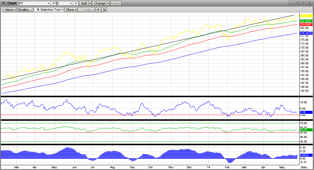
To show a simple example of what the guts of a market timing model looks like, the graph below is an X-ray view of part of the MIPS3 model. This is how some of the internals of the MIPS3 model see the raw price data from the first graph above. [This is a visual illustration of just a very small fraction of the internals of the MIPS3 model.]
In the graph below, the top straight line is a long-term trend line and the colored lines come from things like moving averages and other trend lines, or combos thereof (the up-trends here are obvious). The three indicators in the bottom half of the graph below come from things like various slopes of the SPY price, proprietary rate-of-change, modified relative-strength-index, and various mixed oscillators. In all cases, the indicators are "Long" when they are above the zero line, and "Short" when they are below zero.
Hence you can see that, even though the first graph above seems to show various opportunities to go "Short", the majority of the internal MIPS3 indicators in the graph below have been highly bullish throughout the entire period. Ditto for the rest of the MIPS3 model. Therefore, the real reason why the MIPS models have stayed Long for the majority of 2013 and 2014 is that the up-trend was very strong the entire time period and so there were no good reasons to trade otherwise (i.e., don't fight the trend) !!!
This is not to say that the market cannot go south quickly. It can, but the guts of the MIPS models can also change quickly. History has shown that the MIPS models react quickly to big market crashes and/or corrections.
The above is similar to the process followed by doctors who examine patients who come in with obvious "markers" on their body (welts, sores, moles, bruises, coated tongue, yellow eyes, unusual skin color, etc). If the patient's condition is not obvious from the outside, doctors resort to modern-day medical equipment that allow them to look deep inside of a patient's head, heart, back, stomach, etc. (like using X-rays, EKGs, CAT scans, MRIs, colonoscopies, etc). MIPS sort of behaves in a similar way.
So, instead of just looking at the surface data and guessing, we have the guts of the MIPS models to break down every movement of the market into segments, and to examine each one separately to come up with a consensus.
|


