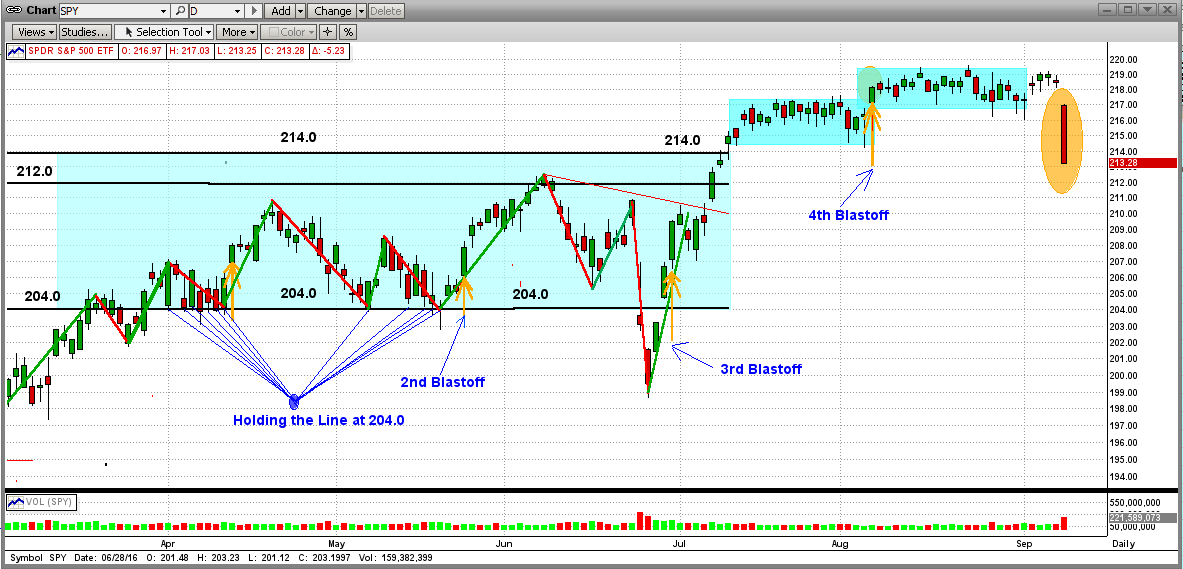
Friday was a terrible day for investors worldwide. And yes, it was the Fed again. How the Fed's actions can overshadow market fundamentals (low earnings, over-valued stock prices, faltering economies throughout the world, etc.) is beyond belief. But then again, an extremely low, or negative, interest rate policy is a major incentive.
Friday's drop seems to many as a disaster [see the graph for the S&P 500 ETF (SPY) below]. And, from the big drop in this daily graph (orange ellipse), it sure seems that way. Seems as though the world is coming to an end. When just a suggestion from one Fed official (not even Yellen) can move the market to that extent, this means to me that large investors and traders are sitting with their fingers on the sell button. Remember, these guys can push a market way down and then way back up like nothing happened.

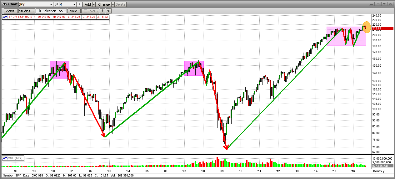
So, just how bad was Friday's drop and how likely is it to continue? For a clue, examine the monthly graph immediately below. Look at (or even look "for") Friday's disaster. What looked like a disaster on the daily graph looks like a "blip" on the monthly graph (orange ellipse). This kind of "puts things in perspective". The point is that, even though Friday was a very bad day, there is no strong indication that the drop will continue (even though the up-trend has been damaged). And, our MIPS models DID NOT ascertain a trend change from Friday's action.

Things can change on a dime, so
Stay Tuned...